The quest to package some of the world’s rarest and purest manuka honey led Marx Design to collaborate with some of the best in packaging and print. We speak to Marx’s Tristan O'Shannessy and Mat Bogust from Think Packaging about their award winning, honey-flavoured collaboration with Logick Print.
DINZ Interview
DINZ Interview with - Logick Print, Marx Design & Thinking Packaging
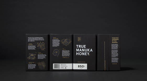
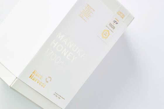
A medium sized jar of the world’s purest manuka honey (MGO 1900+) sells exclusively through Harrods for a cool $5000.
“This is the cognac of honey,” says Marx Design’s creative director Tristan O'Shannessy who was tasked with creating packaging for this outrageous little number: “it's a Rémy Martin or something like that!”
So... how exactly does one go about enshrining such a thing into a vessel that expresses its provenance and unique vintage, mirrors its level of purity and, in a way, does justice – tastefully – to its price tag?
The first thing for Marx was finding co-conspirators for the job at hand; a crew with the right level of craftsmanship to ensure consistency, yet experimental enough to push the boundaries of a product category that had relied on smiling buzzy bee cartoons and Pantone 130 C for way longer than was entirely called for.
Mat Bogust (Think Packaging) and Dave Gick (Logick Print) are mentioned as critical by Tristan, who saw this project as an opportunity to create innovative work connecting packaging and brand.
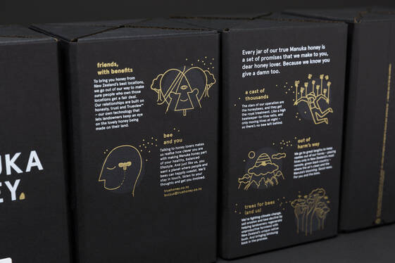
On the core range, the outermost wrap of the package was used as a blank canvas, says Tristan; a layer onto which branding – expressed through illustration, foils and embossing – could express the quality of the product inside through tactility and a subtle hint at luxury. “Dave Gick was recommended as the best,” continues the creative director, “and my experience of him since has always proven to actually be that… especially in terms of print finish, and quality control.”
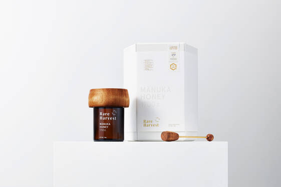
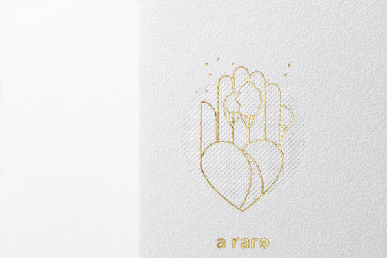
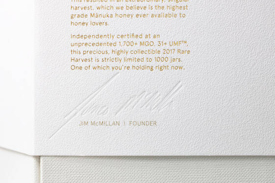
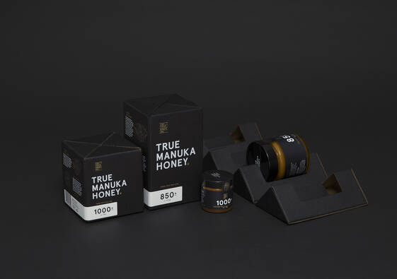
We had a white ink, we had two foils on coloured stock,” says Tristan of the complexities of their initial packaging for True Honey Co.’s core products: the slightly more modest manuka honeys which range in purity from MGO 300+ to around MGO 1000+. The font was Apercu, a grotesque sans-serif which in some places is used as tiny as five-point and finished in gold foil. Some of the illustrations (by US illustrator Christopher DeLorenzo) were equally slender, also in foil, and often printed directly onto embossing that emulated a sort of textural pointillism.
“I genuinely think other printers wouldn't have been able to do it,” continues Tristan, “you need to have a really, really quality finish to make sure it remains legible. That means those foil blocks need to be super crisp and go down really smoothly.”
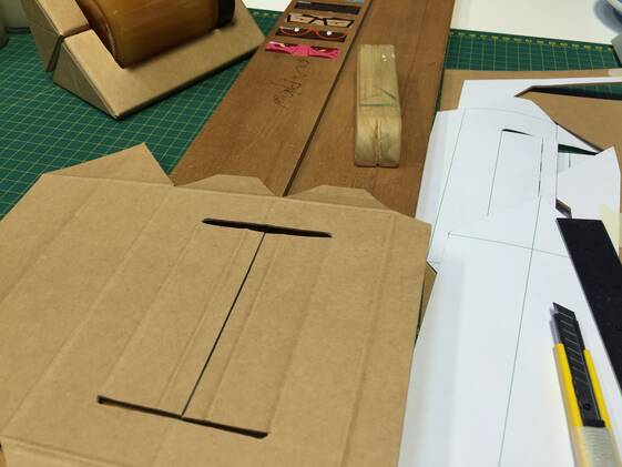
Besides the demanding print brief of the wrap, Logick had to maneuver a heavily-engineered cardboard package devised by the ever-so-energetic Mat.
“We knew we wanted to be different…” he says, “our priority was to have a pack that can do everything: be semi-luxe in terms of its finish, but also kind of industrial because you can throw it across a room and it doesn't break and it opens up in a totally different way to probably any honey we've seen.”
And that, it does.
“Tristan came in and had this idea of something opening up and rolling out and then, that kind of turned into sparks for me!” says the cardboard master, “[I started] hand-modeling these ideas and hand-cutting all these segments and trying to work out how they would clip together.” It is here, however, he injects a caveat of realism to his enthusiasm: “but... you also don't want to be that dickhead designer that everyone loves because of what you've done but when it gets to procurement or production everyone hates because it is totally impractical!”.
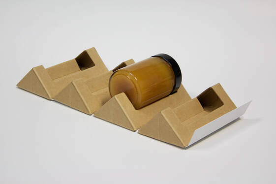
The solution was somewhat inspired by sweet treats originally created in York, England, back in the 1930s: Terry’s Chocolate Orange. The iconic, orange-shaped candy is composed of 20 individual segments joined at the centre both by orange oil and by an outer, foil wrap.
“You basically open the wrapper and these segments pull off,” as you would with an actual orange, “but we found it was just clumsy and [the honey jar would] fall off. So that's when I kind of thought about sticking it to that kind of outer wrap and having it as one piece.”
The cardboard box was devised out of four, pyramidal wedges with cutouts in the middle so that the pots of honey could fit snugly in the centre once all the pieces had been joined together. To keep the wedges as a whole, the wrap mentioned above would tightly enclose the individual parts serving as both a structural and branding component.
The result of this treatment was twofold: first, it removed the need for bubble wrap, foam fillers or petrochemicals at any stage of the honey’s transportation and, by securing the wrap with a perforated tab, it created a pleasantly tactile unboxing experience.
“The tolerances to get this all snug and tight and wrapped around the jar were quite crucial, [especially] if it was accidentally dropped,” says Tristan, talking about the importance of the job done both by Mat and Logick Print.
“There's a bevelling here,” he says pointing at the corners of the box, “the radiuses aren't sharp. Mat and Dave worked quite closely on getting the dieline and the embossing plate perfect to make it all come together and work.
“We really tried to push the boundaries and in all areas – the form was part of it, but the print finishing quality was a big part of it. With Dave nothing was a problem to try and it brought so much value to the end product. It is great having someone that's working with you and who is willing to help fine-tune your design for best print outcome," according to Tristan.
“A lot of printers won’t do this because it is too hard,” says Mat, “but it seems like Logick wants that stuff… the hard projects. They can do them and always have the capability and patience to pull them off… and that's why they win awards for it.”
Part of the sweet ending to this highly complex, boundary-pushing and category-defining story came in the way of, as Mat says, awards: Pride in Print Awards – Supreme Award (2017) for Logick Print and Best Awards – Gold Pins (2019 and 2016) for Marx.
Most importantly, perhaps: not a speck of Pantone 130 C was splattered, spread or thought of in the making of these honey packs.