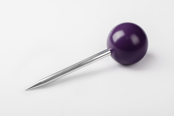
The very best project in each discipline at the Best Design Awards is awarded the supreme, Purple Pin for work that truly raises the bar for New Zealand design.
Purple Pin Case Study — Graphic
Extended Whānau
Toi Tū Toi Ora: Contemporary Māori Art


Purple Pin 2021
Graohics: Toi Tū Toi Ora: Contemporary Māori Art
Studio: Extended Whānau
Judge's comments
Such a world class piece of NZ design. This design sets a new benchmark. A redefining piece of design that pushes NZ design forward. An example of art and design that sits in great harmony and is so ownable and memorable. Best of the best, well done!

Description
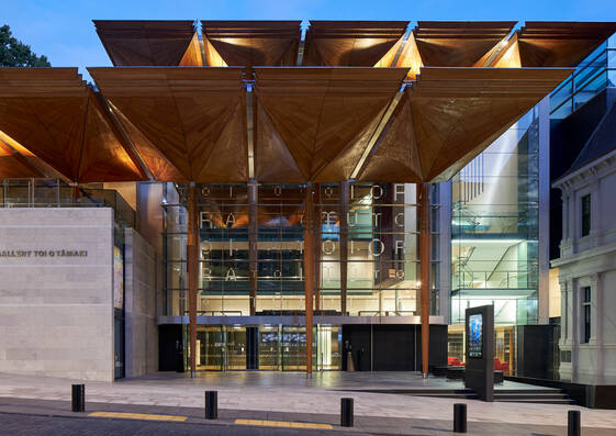
Toi Tū Toi Ora: Contemporary Māori Art is a landmark survey exhibition at the Auckland Art Gallery Toi o Tāmaki. It celebrates the dynamic, ever-changing expression of contemporary Māori art and is the largest show in the gallery’s history, featuring over 300 artworks from 111 artists.
We were tasked with designing the identity for the exhibition across two sites; the gallery and the satellite exhibition at Britomart.
Our approach was to reflect the unique Māori curatorial framework of the show.
The shows curatorial framework is based on the Māori creation narrative. Rather than using conventional Western chronology to organise the works, Māori celestial origins become the organising idea.
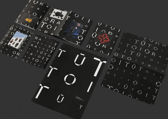
Privileging these Māori concepts of time and space, the show’s title becomes an interwoven time scape. An infinite, ever-changing pattern that spills out of the gallery and draws us into the Māori universe.
The words Toi Tū Toi Ora repeatedly chant their way through the gallery space and out into the world. Proudly affirming the meanings within – Māori art stands strong and in good health.
The titular typeface has straight edges, but also warps and bends in mythical ways to reflect the straight lines of Māori woven art forms, as well as the organic curves of carved art forms.
Artwork images are placed into this typographic matrix, linking all our artists together within the whakapapa of the Māori universe.

Being a survey show, we used a wide and diverse range of artwork images, in place of a single hero image. Care was taken to ensure an inclusive balance of male and female artworks were paired and equally represented.
Shifting between black and white, the colour scheme reflects the extremes of the Māori creation narrative – moving from darkness into the world of light, echoing the many dualities within Te Ao Māori.
All design materials are bilingual – a first in the gallery’s history.
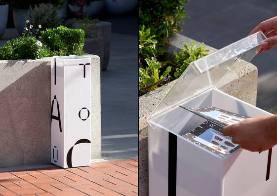
The identity was rolled out across a wide range of applications including invites, brochures, booklets, a large format newspaper, posters, billboards, flags, exhibition merchandise, ads, physical kiosks and environmental graphics at the gallery and at Britomart.
A physical activation was also designed to promote the Toi Tū Toi Ora. The black cube travelled throughout Tāmaki Makaurau and housed a multi-sensory light and audio experience taking people through the Māori creation narrative.