The Romans have Trajan, the French, Garamond, the Italians, Bodoni, and the Swiss, Helvetica. But does New Zealand have a typographic accent? Is there a relationship between type and place?
Purple Pin Case Study — Graphic
Alt Group and Klim Type Foundry
There is no such thing as a New Zealand typeface
Background

These are just some of the questions provoked by Alt Group and Klim Type Foundry in the exhibition, There is no such thing as a New Zealand typeface, but plenty more spring to mind.
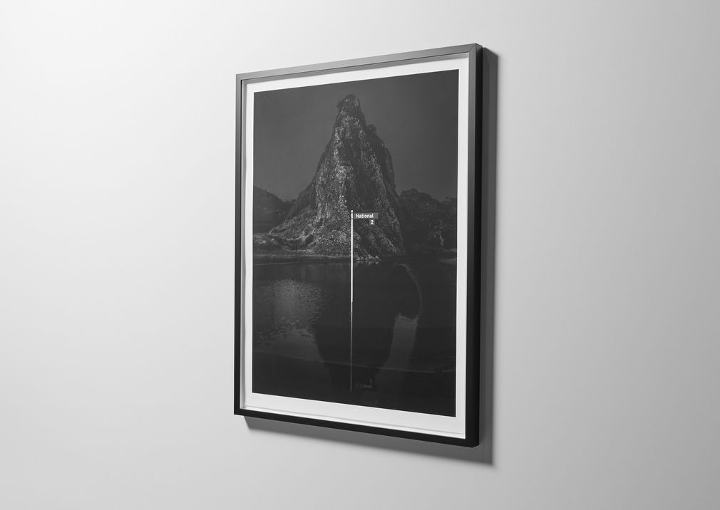
For instance, does National, the typeface designed by Klim’s Kris Sowersby (and described by him as a “confused, pseudo-patriotic impulse”) or its sequel, National 2, signal something about ‘us’ as an emerging design community?
Was Sowersby’s desire to make National predicated not only on the formal quality of the tool, or did the lens of ‘Made in New Zealand’ guide his hand? Is there even such a thing as a New Zealand ‘style’? Can a typeface play a role in creating such a style? Are National 2’s 9,756 letterforms part of New Zealand’s physical and digital design culture?
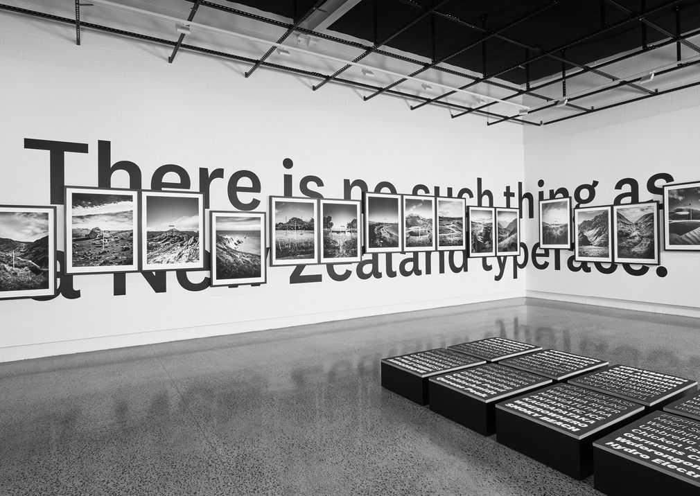
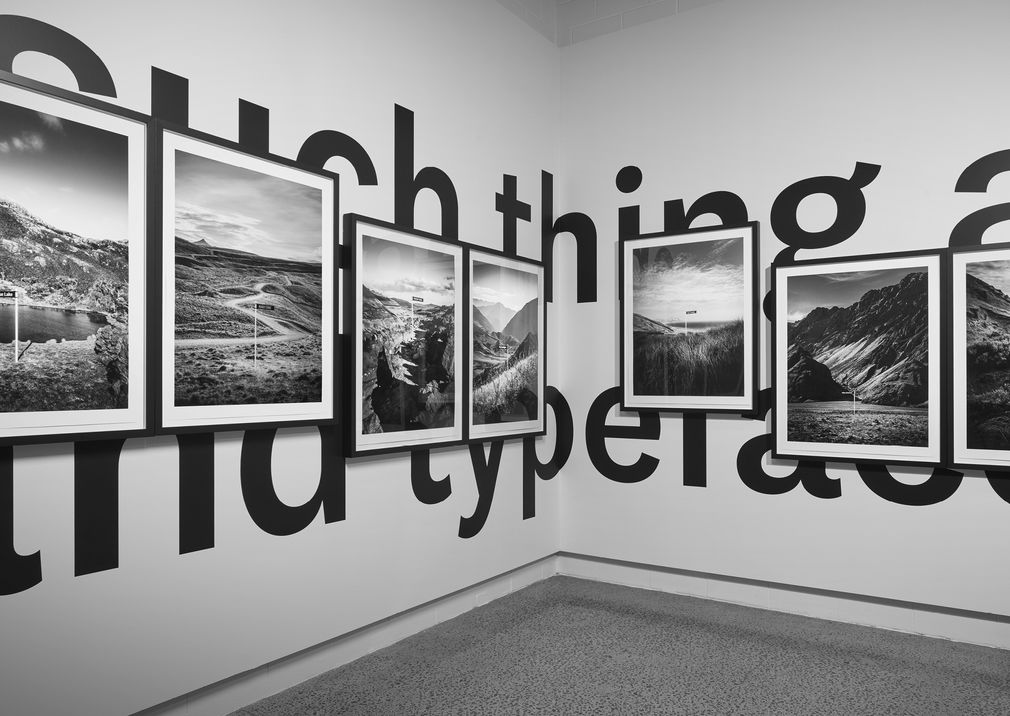
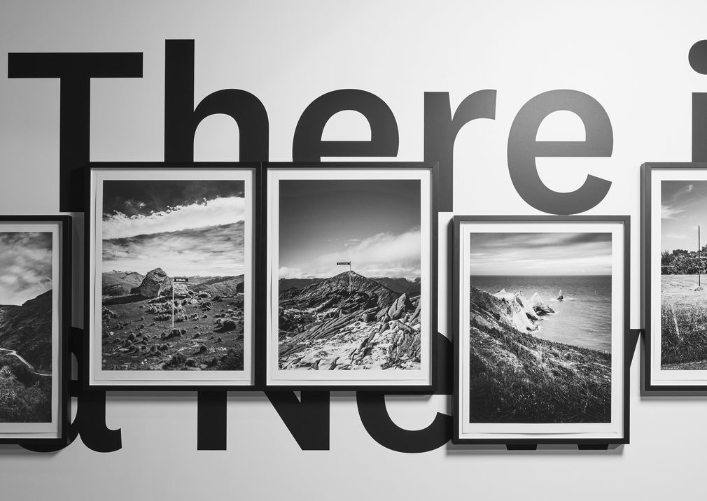
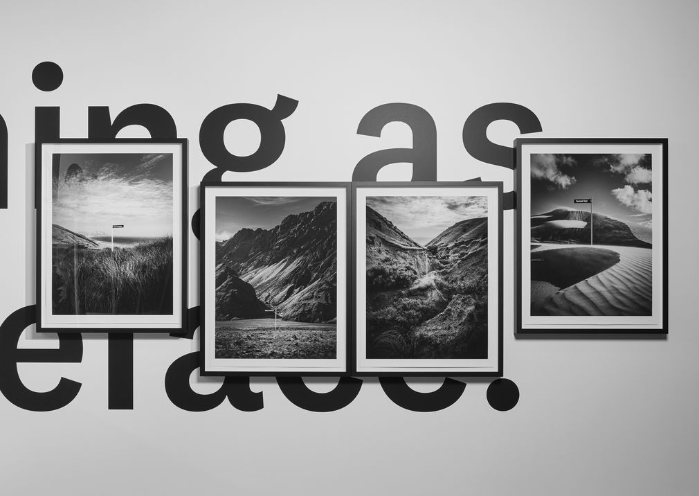
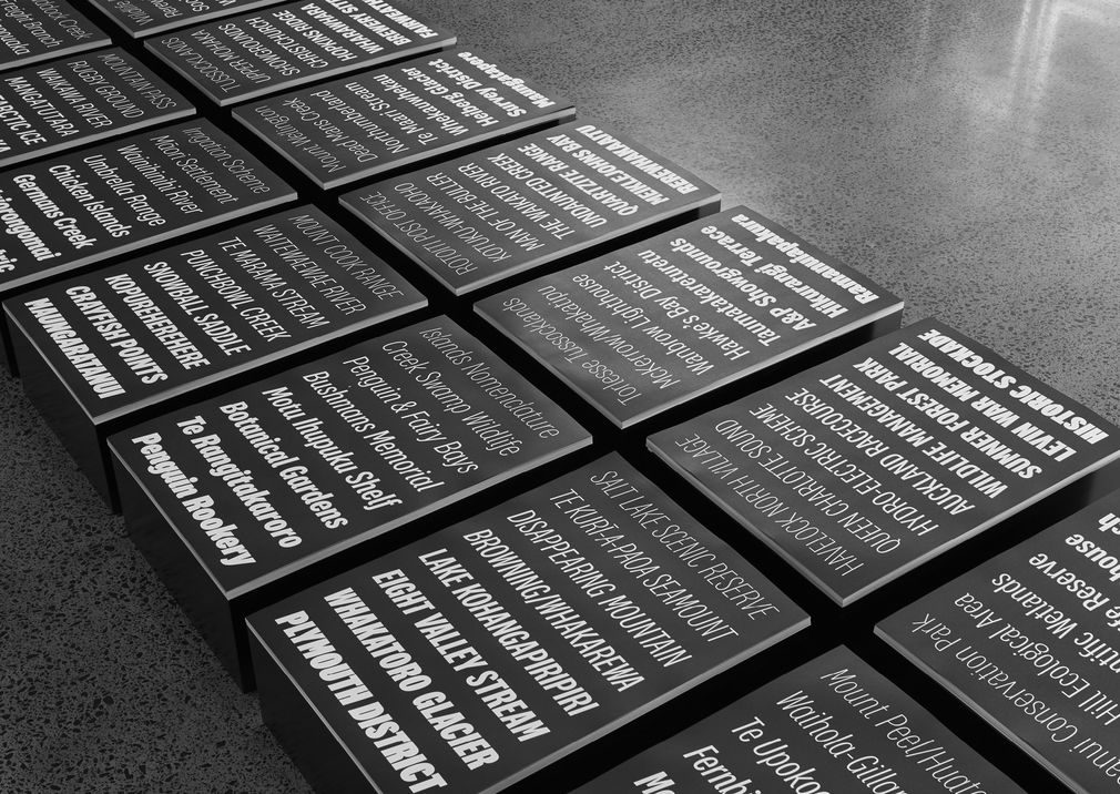
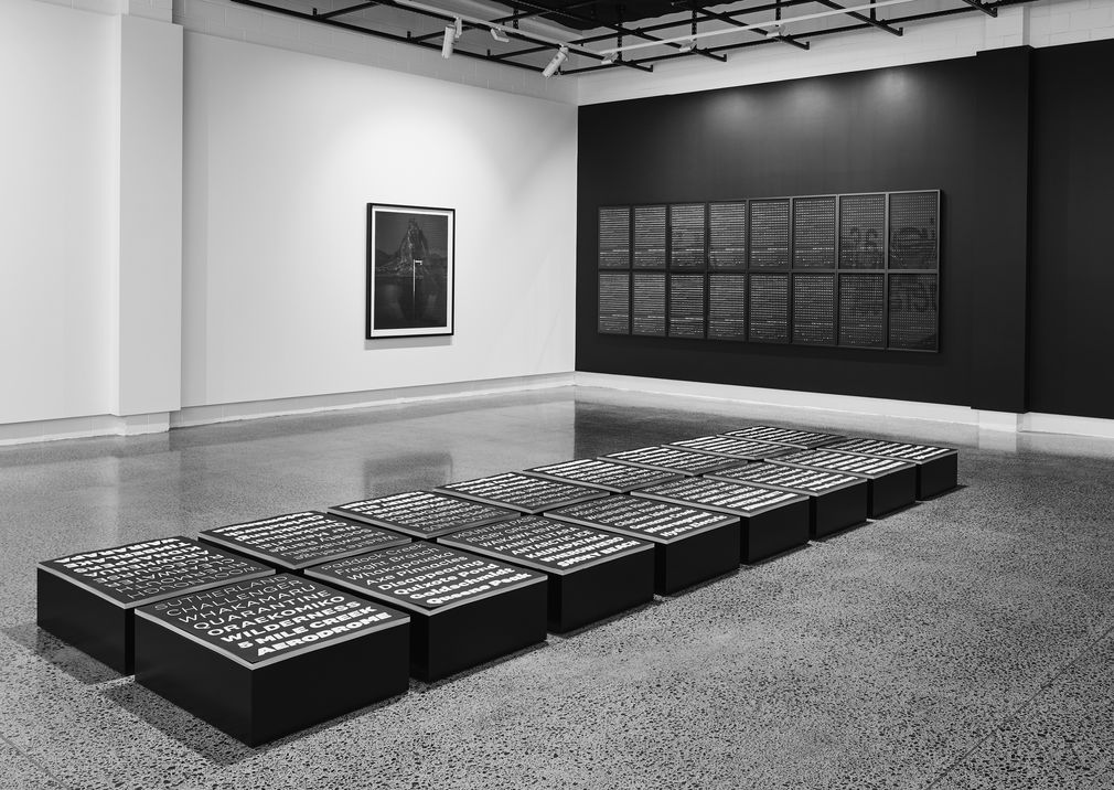
Yes, no, maybe. This exhibition was a vehicle to start a conversation about these many subjects, but definitive answers were not found in the Valley of Darkness, or up Mount Inaccessible, or out at the end of Farewell Spit, which were just some of the remote destinations visited, literally signposted with National 2 and photographed for the 2018 Objectspace exhibition.
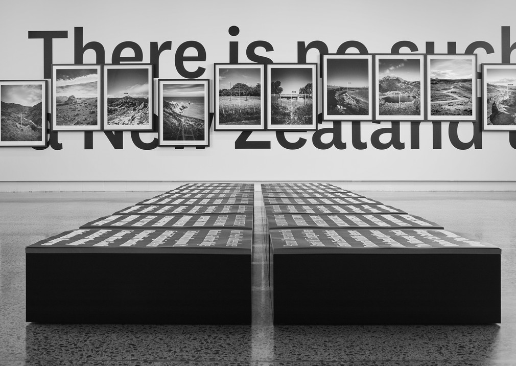
Ultimately, sixteen destinations were selected for the exhibition. Framed at A0 size, gothic and somewhat melancholic, they provide a visual journey through matching contours and shared horizons. Hung on the gallery’s white box walls, they partially obscure the exhibition’s super-graphic title writ large – perhaps the answer to all those questions hidden in plain sight all along.
There might be no such thing as a New Zealand typeface’, but there’s no doubt that National is an integral part of New Zealand’s visual design landscape.