The Financial Times (FT) redesign of 2014 is a global example of how a major news title has reinforced its prestige as a physical object, while also repositioning the daily in relation to its digital platforms. A sharpening of editorial priorities, together with improved layout and ease of use, is signalled by the new look. Led by the FT's head of design Kevin Wilson, in association with design consultant Mark Leeds, the New Zealand connection is in the work of Kris Sowersby, of Klim Type Foundry, who has created a bespoke typeface family for the paper.
Purple Pin Case Study — Graphic
Klim Type Foundry & Financial Times Redesign Team
The Financial Times Redesign
Background
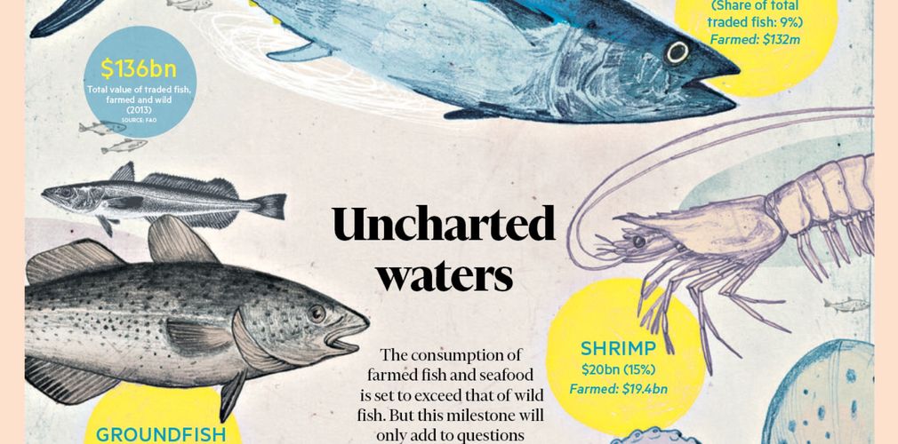
Running alongside the FT’s 24-hour, multimedia publishing schedule, the introduction of the new design has visually and editorially redefined the role of the printed paper. With news breaking on the FT’s digital platforms, the print version can highlight and grow the title’s reputation for deeper reporting and analysis, and reinforce the elements that print does better than digital, such as large-scale infographics. This has provoked a more open and clean design, with improved navigation cues to guide readers effortlessly between different content types. The redesign was also an opportunity to more closely align the experience with the FT’s digital channels.
The newspaper’s 127-year history and power as a brand demanded an elegant, authoritative design, one that called on its British heritage but placed it confidently in a modern setting. These priorities shaped the decision to commission a new typeface, and informed the more relaxed grid and setting. A clearer page structure and design would allow the paper to differentiate standard news from deeper news analysis, while promoting its global network of correspondents and new ‘trend-spotting’ articles.
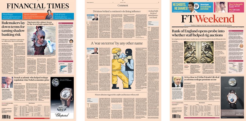
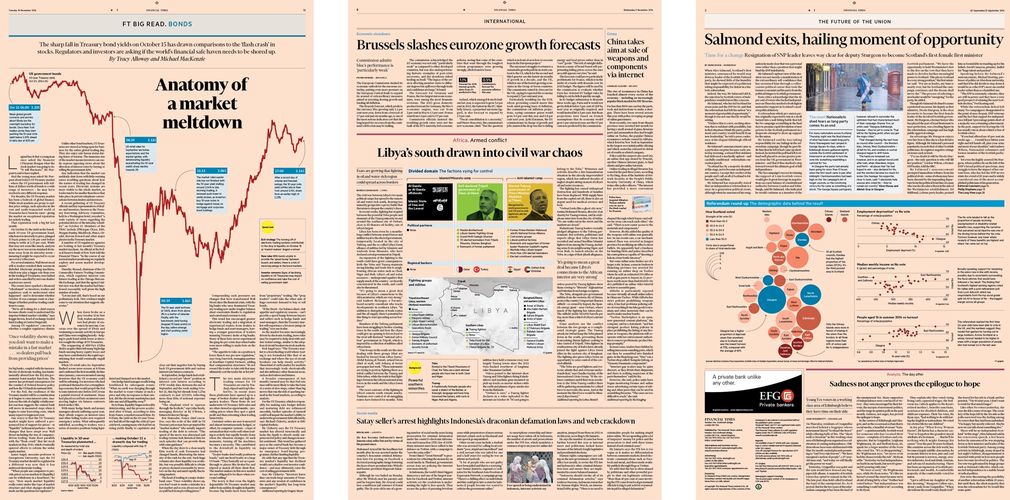
The original paper was a traditional eight-column broadsheet, with all the visual clutter that entails. Moving to a more readable six-column setting better suited the modern style of journalism, and creates a more relaxed feel for in-depth reading. Subdivisions of the basic grid allow pace, energy and variety on the bigger stories and packages. The column measure and spacing are closer to the digital reading experience on desktop and mobile channels, and the simpler grid has also simplified planning and commissioning.
Part of the graphic redesign was a focus on colour infographics, a dimension of the existing newspaper much valued by readers. This was an opportunity to make them sharper and more identifiable with the title, wherever they appear – increasingly important now that graphics are shared on social media outside their context on the website or app. Their style, colours, scale and type were revisited to facilitate this.
Financier, a new, custom serif font was developed for the paper by Kris Sowersby. The brief was to look beyond a traditional newspaper typeface, and explore something that worked on a wider set and column measure – emphasising the considered nature of the journalism – and which would work from wide broadsheet pages to the narrow screens of mobiles. Sowersby followed aesthetic cues from some of Eric Gill’s classic typefaces for a British flavour, and developed a family of complementary typefaces that feel like they belong together even though they don't always look alike.
Advertising was another element in the redesign that would support the goals of greater clarity and simplicity. The editorial team worked alongside the commercial team to enhance the advertising proposition: offering more standardised high-impact, premium advertising positions. These changes helped the advertising sales team to post an operational plan revenue surplus.
The Financial Times redesign “takes all the skills exhibited in this competition and creates a truly remarkable, rigorous, design system,” said the judges. “All the many minute decisions come together perfectly and ensure the Financial Times maintains its position and weight with a physical presence. The total design package.”
—Andrea Stevens
www.folio.nz