Each week the Designers Institute will release a case study on a Best Design Awards 2019 Purple Pin winner
– a project description in the words of the designers along with a short interview with writer Mike Barrett.
Purple Pin Case Study — Graphic
Seachange
Supertrash
Graphics: Supertrash
Studio: Seachange
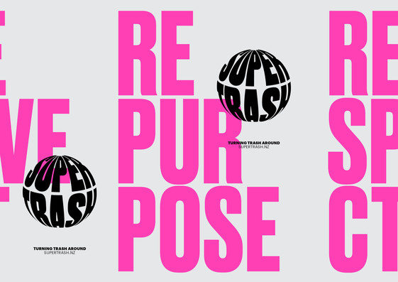
Super Trash - turning trash around
Project description
Supertrash is a small, family-run collection service with a big purpose – to help divert waste from landfill through circular solutions. This involves repurposing, recycling and reimagining what we do with waste. From the simple things, like composting and ensuring waste is sorted correctly, to new initiatives, such as transforming used glass bottles into high-end glass pendants or using cardboard to harvest mushrooms.
Since 2012, Supertrash has diverted almost six million kilograms of waste from landfill. They are driven by innovation and a desire to help our planet.
Their brief was simple: design a bold identity that goes against the grain of traditional waste management companies and captures their vision.
Solution
Our strategy was to totally disrupt a sector that felt tired and disingenuous. We wanted to change people’s perception of what a waste management company can be and position Supertrash as the new-school, innovative, energetic and youthful player, who truly embraces the idea of a circular economy.
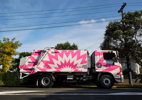
The resulting identity can’t be ignored. It’s a bold fluoro pink – a colour never before used in this sector and something completely unexpected. We wanted the entire brand to be informed by the concept of a circular economy, something Supertrash is working hard towards. At its heart is an iconic globe logo underpinned with our brand proposition – “Turning Trash Around”. The logo animates in digital environments by spinning, referencing the global impact that local actions can have.
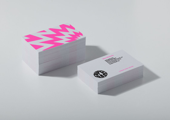
Pragmatically, it was important the logo worked hard across multiple touchpoints – from the front of a waste bin to staff uniforms and vehicle livery. We distilled reference points of ‘superheroes’ (stretched and distorted typography), ‘pop art’ (bold shapes and disruptive messaging) and ‘repurposing’, by overprinting typography and graphic elements to suggest recycling and reusing.
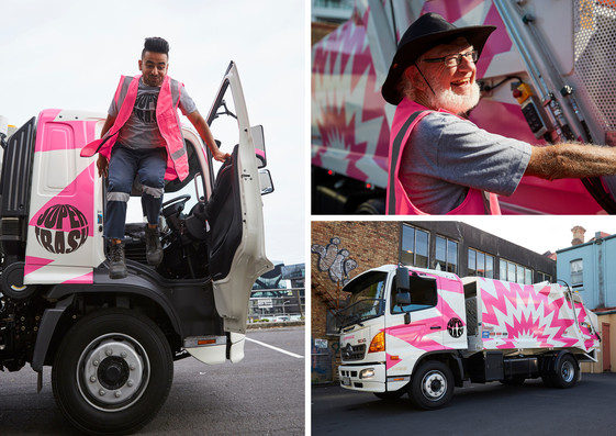
Supertrash’s most visible canvas is their rubbish trucks. Our strategy was to do something that couldn’t be ignored, to go against convention and grab attention. The result was a bold comic-inspired pattern take-over, and an explosive graphic that playfully nods to the loud banging and crashing noises associated with rubbish trucks.
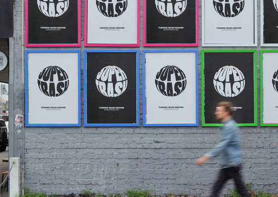
In the spirit of low-fi and cost-effective marketing, we ran a one-colour print, street poster campaign and designed useful merchandise items to help spread the important work Supertrash is doing. Our Anti Plastic Bag tote is a response to the 500 years it takes to breakdown a single-use plastic bag. Other print items were digitally printed on 100 percent recycled stock and integrated a fluoro pink ink.
Q&A
Mike Barrett talks to Amanda Gaskin & Tim Donaldson, Seachange
Hi Amanda, Tim. Congratulations on winning the Purple Pin last year. How are things going in sunny Northcote? What are you working on at the moment?
Hi Mike, nice to catch up! Thanks, it was a massive thrill to pick up the Purple Pin, especially for such an awesome client who are genuinely doing amazing stuff for the planet. So we're writing this in lockdown, hopefully once this is published we're all out and about and normality in the world is somewhat restored.
We've got a lot of branding work on at the moment; a fun sushi brand, a plant-based food brand, a tech-startup in San Fran, a contemporary art gallery and some luxury eco-cabins, plus our ongoing campaign work for Silo Theatre. We also recently started working with Moa Brewing Company, which has been really exciting for us. We're looking forward to sharing more of that work when we can.
By my count, you've had quite a successful year at the Best Awards. What was it, seven awards all up?
We had a good one. We picked up a Purple Pin, five golds, three silvers, and one bronze. We're just a studio of two, super busy with work and juggling a two- and a five-year-old – we don't get to come up for air often. It was nice for the work to be acknowledged and to reflect on what we've done!
Future designers Fyfe and her little brother Dusty.
Personally, I'm a fan of the Ghost Street Dumpling project, but it's Supertrash that the jury took a real liking to – how did that project come about?
The Ghost Street Dumpling poster was just one of those fun little ideas, when we thought, 'hey, don't you think a dumpling weirdly looks like a ghost?', and it kinda designed itself. Supertrash, on the other hand, was a real labour of love – there were so many problems to solve for them. It came about over a beer with some mates. One of them, Steve, who happens to be the client with his wife Gemma, said afterwards: "Hey, I need to put something on the sides of our rubbish trucks, can you help?" Before we solved the trucks, we, of course, had to start right back at the start.
They’re obviously an adventurous bunch, were they surprised at the direction you took, the popping pink, the spinning logo, and other devices?
In the context of the waste management sector, Supertrash are like the Sex Pistols. They're young, disruptive, visionary, energetic, and so passionate about helping the planet. They want to divert as much waste as possible from ending up in landfill and we wanted to arm them with something that aligned to them personally, as well as providing a platform to really engage with people. It's fair to say they were surprised and challenged, but hats off to them for being bold enough to roll with it.
And what were your initial thoughts about the project – what was your way in?
We started with a simple positioning piece to define their purpose. Simply speaking, they're all about moving towards a circular economy, diverting as much waste from landfill as humanly possible. This involves correctly sorting waste streams, and also re-imagining what we can do with waste through repurposing and recycling. We articulated this idea as 'Turning Trash Around'. Everything flowed from this. We knew whatever we did, it needed to disrupt, and capture the energy and vision of the Supertrash team.
What range of precedents did you look too for reference? Did you find anything contextually relevant?
The waste management sector hasn't had a lot of love from designers. Nothing too inspiring whether you look at competitors locally or further abroad. So we decided to treat Supertrash as if they were in a category of their own. In essence, no one is doing what they're doing, so it's actually quite accurate. Like most of our work, we looked for international references in totally different sectors. We looked to pop-art, 70’s activism, and contemporary designers' work, including Paula Scher with her work for Public Theatre, and the energy and spirit Hort captures with their work for Nike. We also wanted to celebrate the humble rubbish truck driver; those unsung heroes looking after our planet, and give them a sense of pride with the new brand.
Well it certainly sounds like you’ve enjoyed it; not the tough task I was expecting!
We found it the opposite... Also knowing our client before we started was helpful. We knew Steve wasn't going to buy into any of the usual agency bullshit, so we just slammed right into it, kept it lean, and told him that he needed to trust us and do exactly what we said, haha.
We do a lot of work in the arts and cultural sectors, and other areas that most designers would class as ‘cool’. But funnily enough, the ‘creative’ jobs can sometimes be more restrictive; gallery work, for example, generally needs a lightness of touch; a complementary identity system that packages the art rather than competes with it. Also, there are countless examples of kick-ass work in these sectors. We genuinely got so excited about being the first people in the world to do something fresh and rad for a company in waste management.
I might be off the mark, but there seems to be some sort of pulp-disco vibe going on. Maybe it’s the way you’ve shaped the logo into a ball. That certainly seems to be a versatile device… tell me a bit about it.
Haha the logo does spin around, but we've yet to apply it to a disco ball, maybe next year's xmas do? The logo is born from the idea of 'circular solutions' it references the globe for the impact their work has on the planet. It constantly spins in digital application. The stretched typography is a reference to superheroes and pop art. The logo acts as a stamp and can be applied over just about anything. We utilise the idea of overprinting to evoke a sense of repurposing.
Final question – if you had your time again, would you do anything differently?
Charge more : P