The Steinlager Tokyo Dry brand, designed by Inhouse and winner of the Graphic Design Purple Pin, strikes a perfect balance between two worlds. Tasked with reimagining the iconic Steinlager beer brand, Inhouse took a crisp, restrained approach to the brand’s graphic design and produced an intelligent and well-balanced solution to the creative, commercial and cultural challenges faced by the client.
Purple Pin Case Study — Graphic
Inhouse
Steinlager Tokyo Dry
Background

The iconic Steinlager beer brand is one of New Zealand’s most well known and successful. But its longevity had also made it less relevant to discerning younger drinkers. Having reinvigorated the brand successfully with Steinlager Pure a decade earlier, Lion Breweries were confident that, with thorough research and smart design, lightning could be made to strike twice.
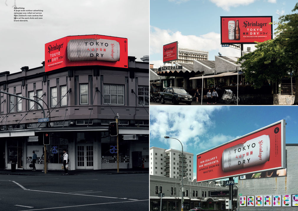
The client was seeking a design-led, boutique sensibility to the project. Inhouse were approached in at an early stage of product development and ideation, and were responsible for the naming, branding and packaging, as well as briefing the agencies who would develop advertising and point of sale material.
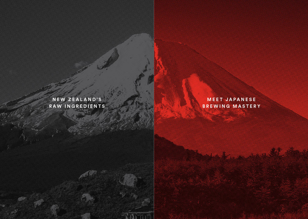
Visiting Japan and immersing themselves in Japanese brewing culture, it become clear to the Inhouse team that authenticity and simplicity were key.
Research had shown that a Japanese-style dry lager was the right direction to take the product, so this gave a clear starting point for the creative journey. Visiting Japan and immersing themselves in Japanese brewing culture, it become clear to the Inhouse team that authenticity and simplicity were key. Their extensive research into Japanese culture and design led them to the Japanese aesthetic principles of Kanso (Simplicity) and Shizen (Naturalness, unforced). For a German-named New Zealand brand producing a Japanese influenced beer, these principles would help deliver a solution with balance and clarity
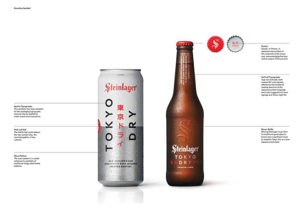
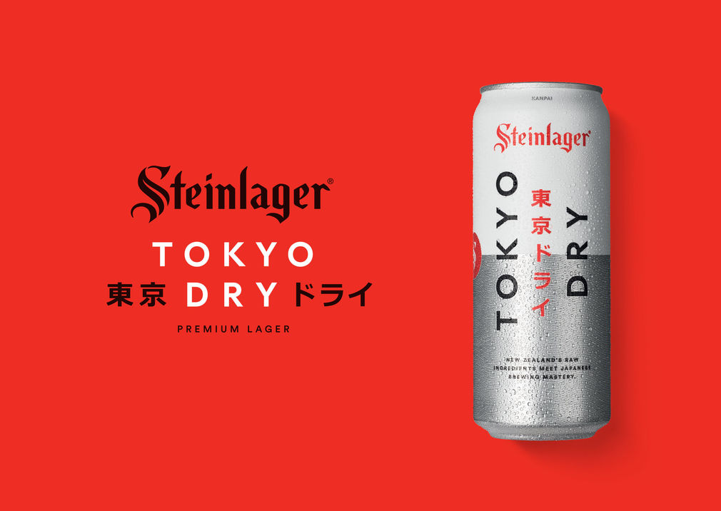
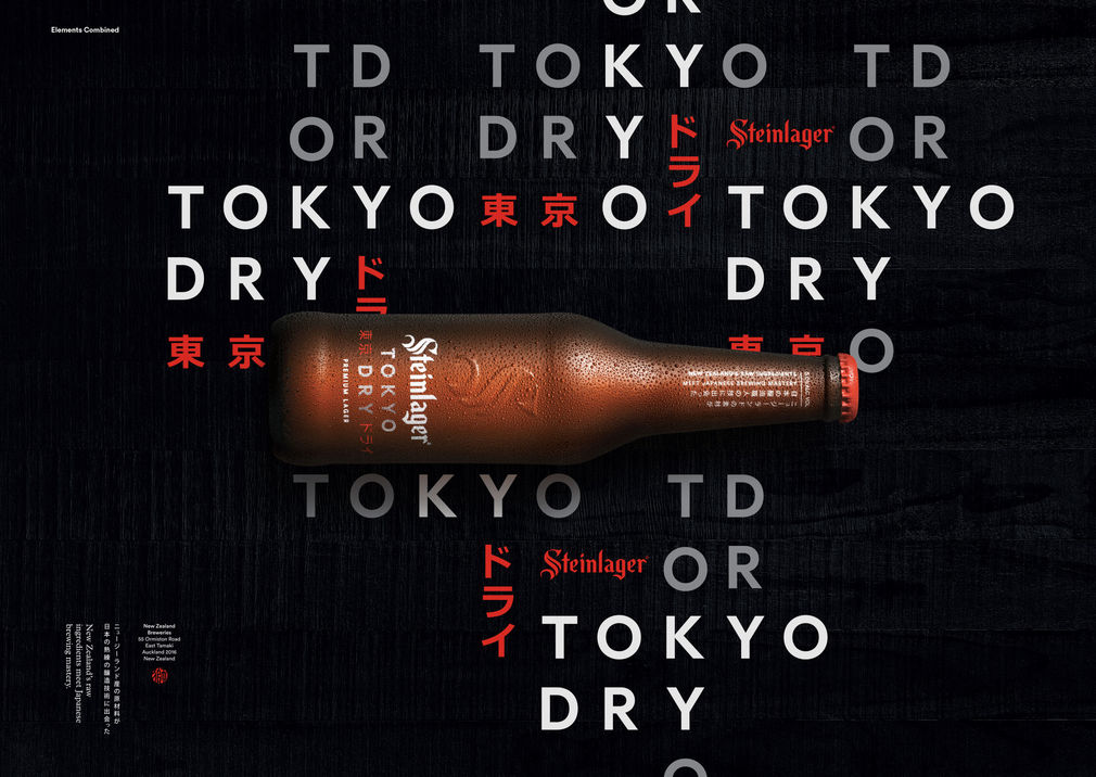
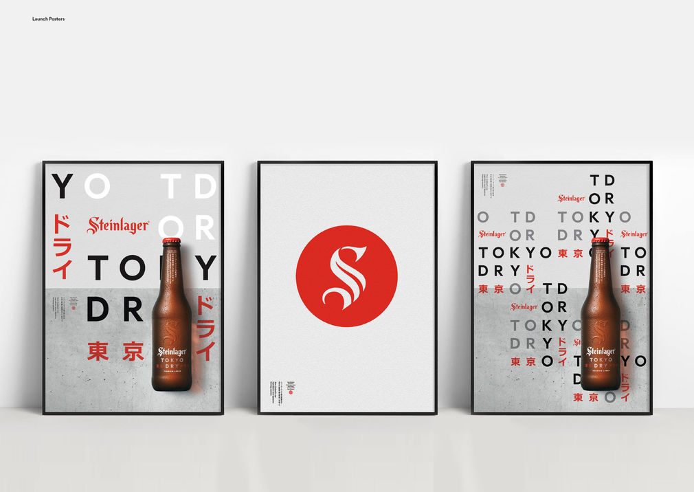
Naming was the first challenge. It become clear that choosing a simple and direct name - Tokyo Dry - would do much of the heavy lifting for the brand’s identity, allowing the graphic design system to be more considered. It allowed the brand to avoid clichéd ideas of Japanese culture and instead focus on an design aesthetic that acknowledged modern Japan and had a technological edge.
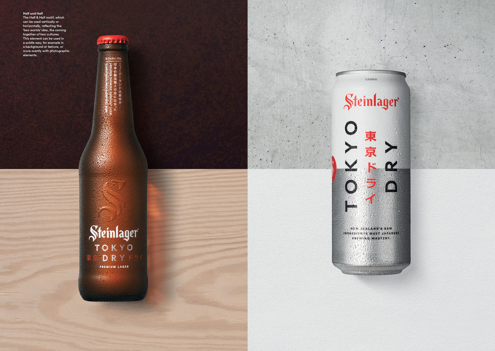
Packaging was the key to unlocking the design system. Inhouse had noted in Japan that among Japanese brewers green bottles were rare, so a brown bottle was the appropriate choice. But it was the can that helped establish a clear design logic. Creative explorations led to a visual combination of the common Japanese silver can and Steinlager’s iconic white can. This became a simple shorthand for harmonious balance of two worlds, the bringing together of two culture, further informing the graphic design system as other elements were developed.
It become clear that choosing a simple and direct name - Tokyo Dry - would do much of the heavy lifting for the brand’s identity, allowing the graphic design system to be more considered.
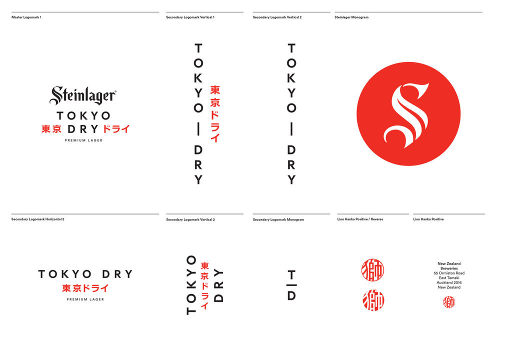
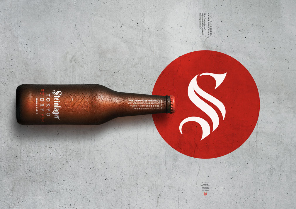
Another simple shorthand was the integration of the existing Steinlager brand, with the familiar ‘S’ mark centred on a red disk echoing the emblematic Japanese rising sun. Other crisp elements filled in the design palette. A traditional Hanko was commissioned - a makers mark stamp that says Lion. A graphic wave pattern made a subtle reference to traditional indigo printed textiles. And the typography was spacious and tracked out, sometimes set vertical, other times rotated.
As the winner of the Purple Pin for Graphic Design, judges described the work from Inhouse as something fresh and different. Applying a boutique sensibility to a mass market brand, the graphic design for Steinlager Tokyo Dry is an exemplary piece of work across various mediums, from packaging to brand standards, with a clear idea executed to the highest standard.
Easterbrook Words & Ideas
- Mark Easterbrook
www.easterbrook.co.nz