Each week the Designers Institute will release a case study on a Best Design Awards 2019 Purple Pin winner
– a project description in the words of the designers along with a short interview with writer Mike Barrett.
Purple Pin Case Study — Interactive
Resn and Colenso BBDO
Stop the Spread
Interactive: Stop the Spread
Studios: Resn, Colenso BBDO

Stop the Spread
Project description
The starting point for this campaign was the realisation that the effects of breast cancer can spread through the wider community like a disease. For Colenso BBDO and Resn, this was an opportunity to help Stop the Spread of breast cancer by highlighting its social effects. The goal was to reach whole communities, which would in turn encourage more women to get a mammogram.
The approach was to design a digital experience for Breast Cancer Awareness Month that could be shared over social media, reminding people that a mammogram gives a better chance of survival. Health-related campaigns carry a dual challenge – the subject matter needs to be approached with care and sensitivity, and they need to be compelling; in this case, compelling enough for people to discover how the effects of breast cancer can spread through families, friends and communities.

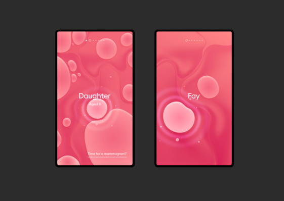
Stop the Spread is carried by a visual metaphor – cell division. It shows how the effects of breast cancer spread from person to person. Boldly, the campaign uses interviews with real families affected by breast cancer, with audio paired with the animations of dividing cells. New cells, representing family and friends, split from the original, representing the cancer sufferer. Each individual shared their own experience, highlighting how breast cancer affects the entire community.
A key success of this project is that the personal stories are not overshadowed by the design, thanks to a carefully considered approach and a minimalist aesthetic. The experience was built on a two-tone colour palette with clean, evocative shapes and simple interactions. The design brings the stories into sharp focus while stressing the importance of getting a mammogram.
It has certainly been a success. The campaign reached 79 percent of all Kiwis and, during October, which was awareness month, more women booked a mammogram than ever before, making it New Zealand’s most successful mammogram awareness drive.
Find out more about the campaign here.

Q&A ___
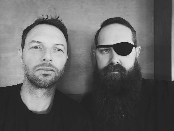
Mike Barrett talks to Rik Campbell & Steve Le Marquand, Resn
How’s Resn going with the lockdown, Is everyone working remotely working alright, and how are your overseas teams going?
Like the rest of the world, Resn has had to adjust to life in lockdown and make changes to the way we live and work.
We saw the writing on the wall early on—scrawled across the brickwork in giant red letters—and made the transition to remote working before the lockdown went into effect.
Our Amsterdam office was working from home in early March and Wellington made the transition just before the government announced Alert Level 3. Working in the digital landscape, our tools and processes easily translate to the home office. And, since most of our clients are overseas, we're used to long-distance collaborations. It's almost like we've been training for this our entire careers.
Of course, there were unavoidable disruptions. Cats. Children. Running out of milk. Not to mention the fact that as soon as the world started to go into isolation, our location-based experiential work evaporated like morning mist. But, on the plus side, the industry is having to rethink its entire approach to reaching an audience and has been making an incremental but perceptible pivot towards digital.
As of right now, both of our studios are working hard on some exceptional new projects in the pipeline.
The only difference is we’re not wearing any pants.
Shall we begin by talking about the origins of this project? How did it come about and who were you working with?
Colenso BBDO approached Resn about partnering for the Breast Cancer Foundation’s annual awareness campaign.
They were looking to digital because they had seen strong engagement with previous awareness campaigns online.
They came to us with the insight that the effects of breast cancer spread like an infection through family and friends. We thought this was a strong concept on which to build a digital experience. We were immediately on board.
How did it pan out from there? Who did what?
Colenso came to us with the idea of using real interviews paired with an interconnected network of cells to represent the cancer patient and their family and friends.
We worked with them to refine the idea so it would work as a mobile-first experience. One of the most challenging aspects was to create a design based around the idea of cancer spreading like a contagion without putting people off.
As you can imagine, we had to treat the subject matter with a certain amount of sensitivity. We think we struck the right balance between something that was beautiful to look at and emotionally engaging while raising enough concern to prompt action.
Can you break down the resulting work into discrete parts? Technically, how did you make it?
After we came up with the design, we had to figure out how the cells moved and interacted in a way that looked natural.
We used a force-based layout to position and distort the cells so that all of their edges were roughly the same distance from one another. Inside of each cell was an array of “spoke-springs” that compress when they get close to another cell and expand when they move away.
The motion system is dynamic, and the random movement creates a unique layout each time. The paint swirl effect is a “cheated” liquid distortion. Clones of the cell’s geometry are enlarged, and a shader distorts the background layer like a lens.
It's a poignant piece of work – and the voices that accompany the visual elements are very effective.
Have you worked on any other projects where real stories become such an important part of the work?
One that immediately springs to mind is a project with Razorfish for Dove called “Have Your Say”, which looked at how the media portrays women in sports. It featured real stories from female athletes and highlighted how the media objectifies female bodies.
We hid the athletes behind a barrage of sexist media quotes that appeared on the site in real-time and gave users the chance to respond to sexist comments immediately.
As I understand it, Stop the Spread has been very successful. How was it launched into the world; where was it seen the most?
The campaign won several international web design awards, but the project was very much focused on a New Zealand audience.
It was a multi-channel campaign, but the web experience was a big focus (even the TVCs using footage from the digital experience).
Overall, the campaign was seen by 79 percent of New Zealanders and more women than ever before booked a mammogram during October Awareness Month, making it New Zealand’s most successful mammogram drive ever.
* Rik and Steve received the prestigious Best Design Awards John Britten Black Pin in 2018 which acknowledges their leadership, vision and achievement both in New Zealand and internationally.