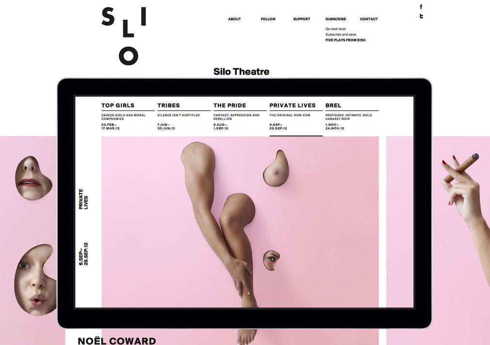
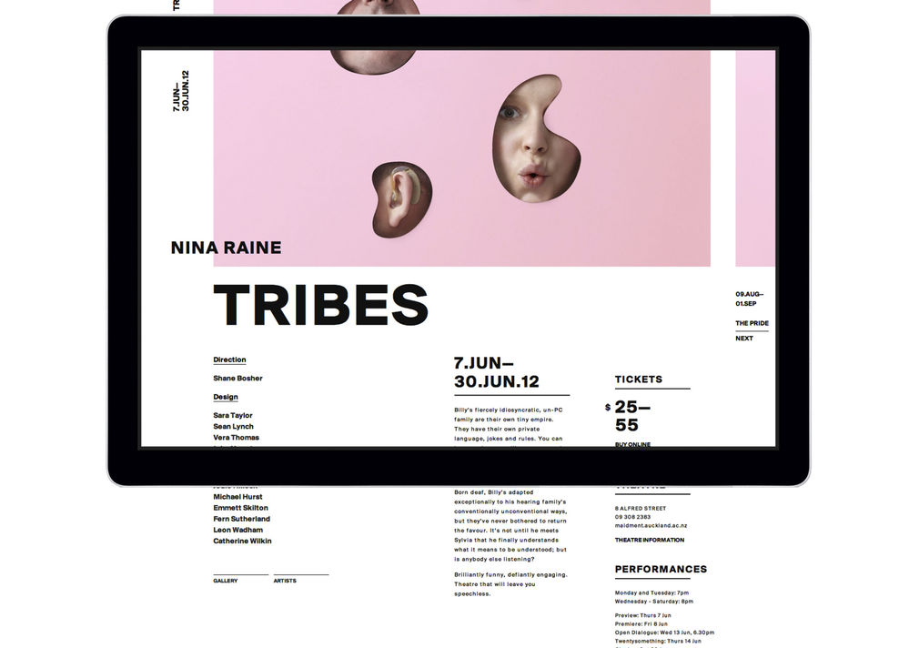
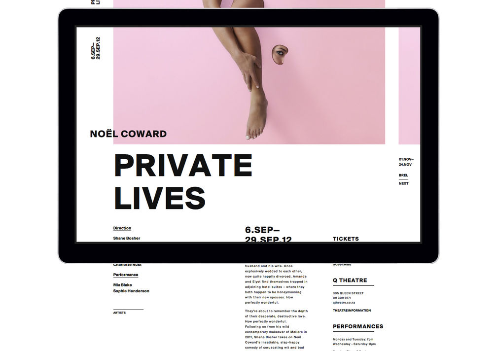
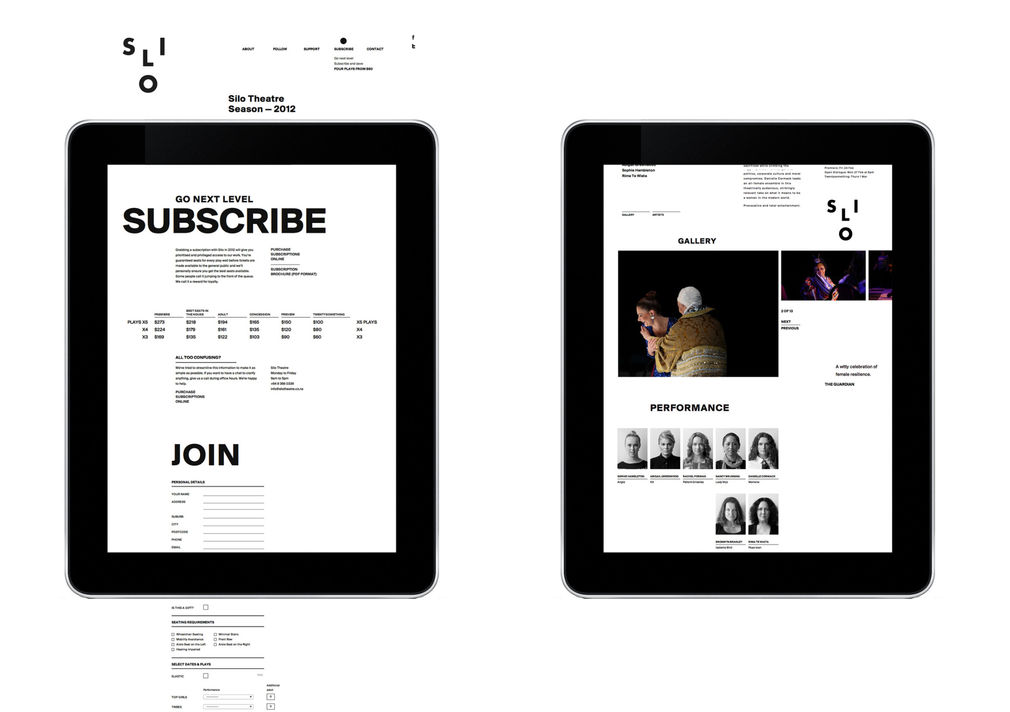
There's nothing timid about Silo Theatre's website: modernist typography, dismembered limbs and at least one naked breast, but Silo presents bold, cutting-edge theatre and you’d expect nothing less.
Purple Pin Case Study — Interactive
Sons & Co.
Silo Theatre
Background
What were the aims of the site?
Primarily, to sell season subscriptions and production tickets; "Bums on seats", I think was the brief. But there was also the need for a design that was original, bold and a little bit playful. It would be disingenuous for a brand like Silo to play it totally straight. We knew it, they knew it.
It's a lot of pink?
The Silo Theatre brand and campaign imagery was beautifully done by Alt Group. We like the soft colouring a lot, the design would be quite different with more primary colours. But it'll change every season and with any luck we'll carry on with various shades of cupcake icing and dusty eyeshadow. When a Silo production comes to town and the posters go up, you can't help but notice.
Does a cultural client differ from a corporate client?
The website has a job to do, always, but I think a cultural client may be less inclined to try and please everyone, just the right people. Silo Theatre are very design literate, with an awareness of design as as an important part of our visual culture - nobody involved in the project wanted to put out anything that was ugly, or worse, benign. And being a small organisation there’s a lot of personal investment in the project from everyone at Silo, and therefore a lot of pride in the result.
What do you think makes it a success?
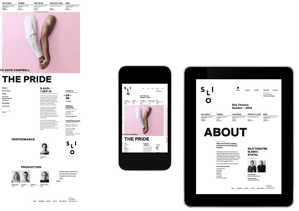
Well, it’s likeable, I think. The logo looks like a face. The website is non-standard, but not frightening, it’s full of interesting images, surprising little interaction details - there’s lots of small things that make it quite fun to use. When we met Shane and Jess from Silo for the first time they told us the company mantra is,“there’s no embargo on artistic risk or ambition”. What better way to work?
—Tim Kelleher, Sons & Co