Envisaged as the first place New Zealanders go to report or learn about cybersecurity risks, the website designed for CERT NZ by DNA is an elegant, intuitive response to a complex brief. Employing a natural language interface and clean typography, the interaction design is firmly focused on putting the user first.
Purple Pin Case Study — Interactive
DNA
CERT New Zealand
Background
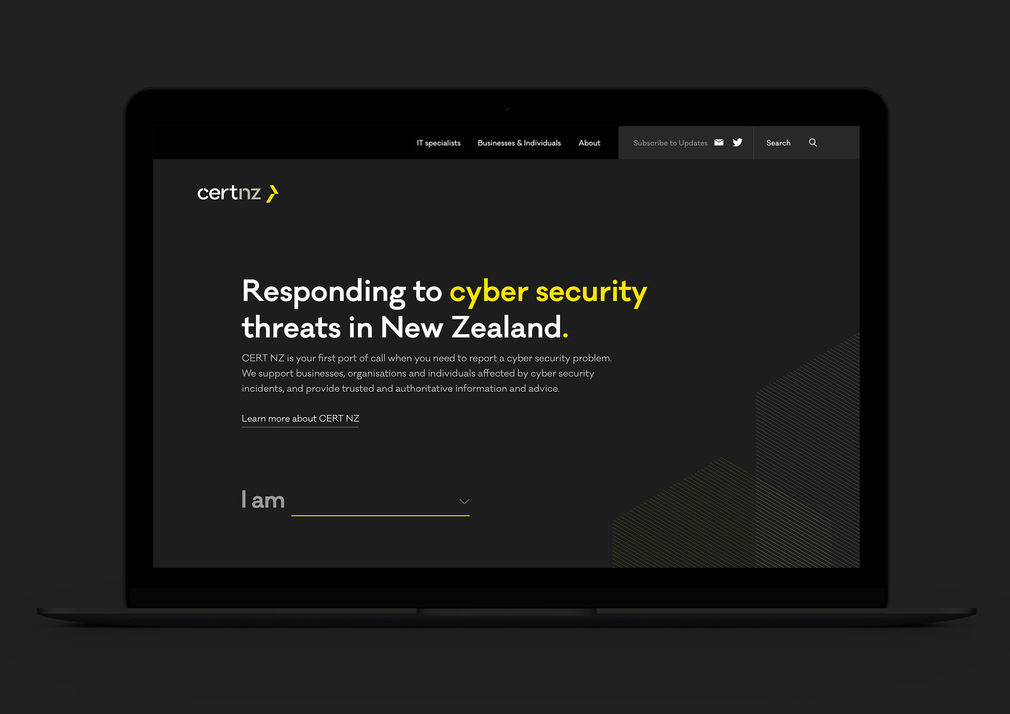


The 2017 Interactive Purple Pin winner was designed by DNA for CERT NZ. Created as an independent agency by the Ministry of Business, Innovation & Employment, CERT enables all New Zealanders to be alerted to, and to be able to report cyber security issues.
This meant accessibility and ease of reporting were core objectives of the new site, as it would draw in a broad audience, from trained cyber security professionals seeking updates, to everyday people reporting an incident and seeking help.
DNA were approached to build cert.govt.nz and its tool for reporting cyber security incidents when the agency was still forming. This presented some significant challenges, but also an amazing opportunity.
With a mostly blank canvas, DNA were in a position to guide the strategic approach that would inform the design.
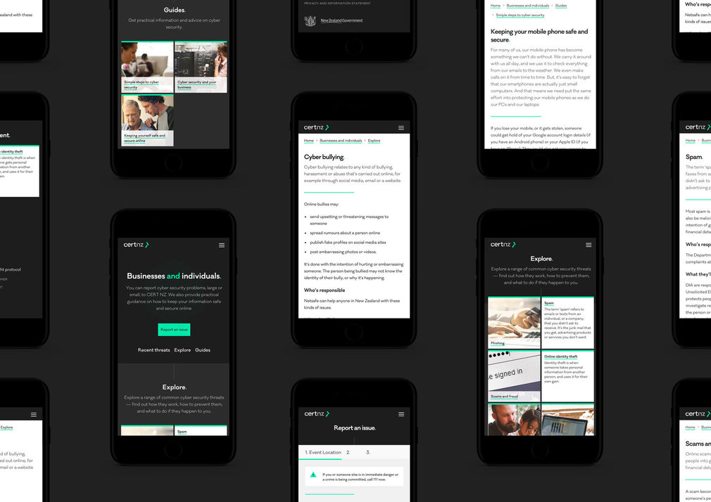
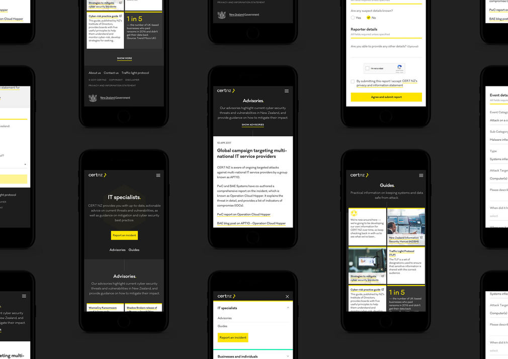
A significant question was how best to offer a satisfactory user experience to such a broad audience with differing levels of knowledge. The technical audience knew CERT’s terminology, whereas most public users didn’t understand terms or discern different forms of cyber-crime.
With the organisation itself being in such an early stage of development, there were often questions without clear answers. DNA and CERT had to work closely and collaboratively to establish the way forward. There was debate around whether to prioritise the expert or the public experience led them to a solution that would serve both audiences discreetly.
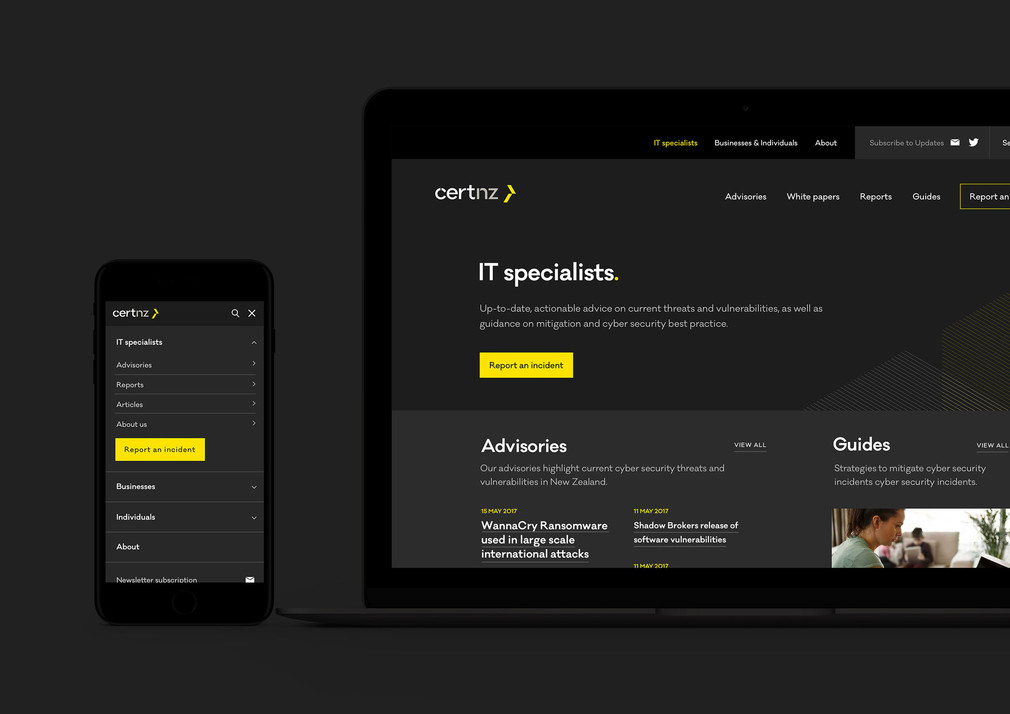
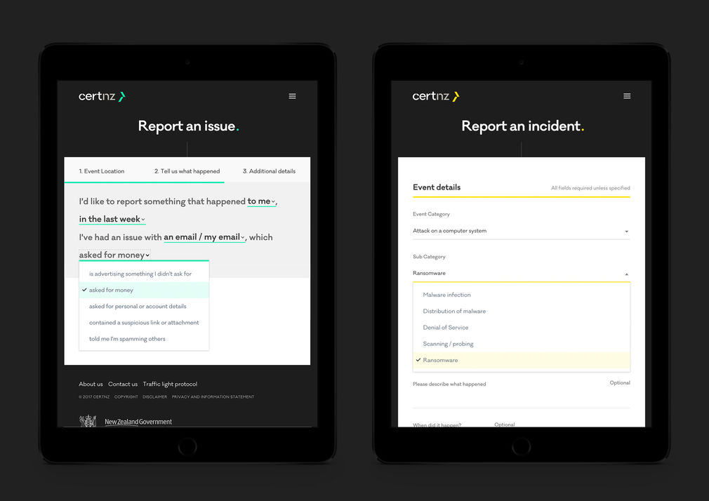
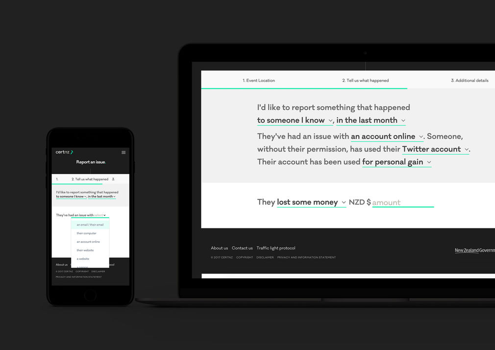
This eureka moment for the site’s design came when DNA proposed a natural language approach to the site’s interface, as a way of accessing the appropriate content for different kinds of users. This offered an alternative to the usual form-filling, which often requires mandatory fields for information the user either doesn’t understand or cannot provide.
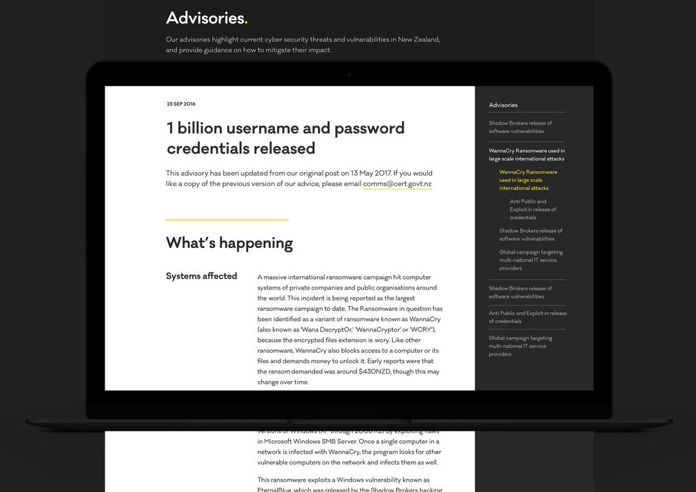
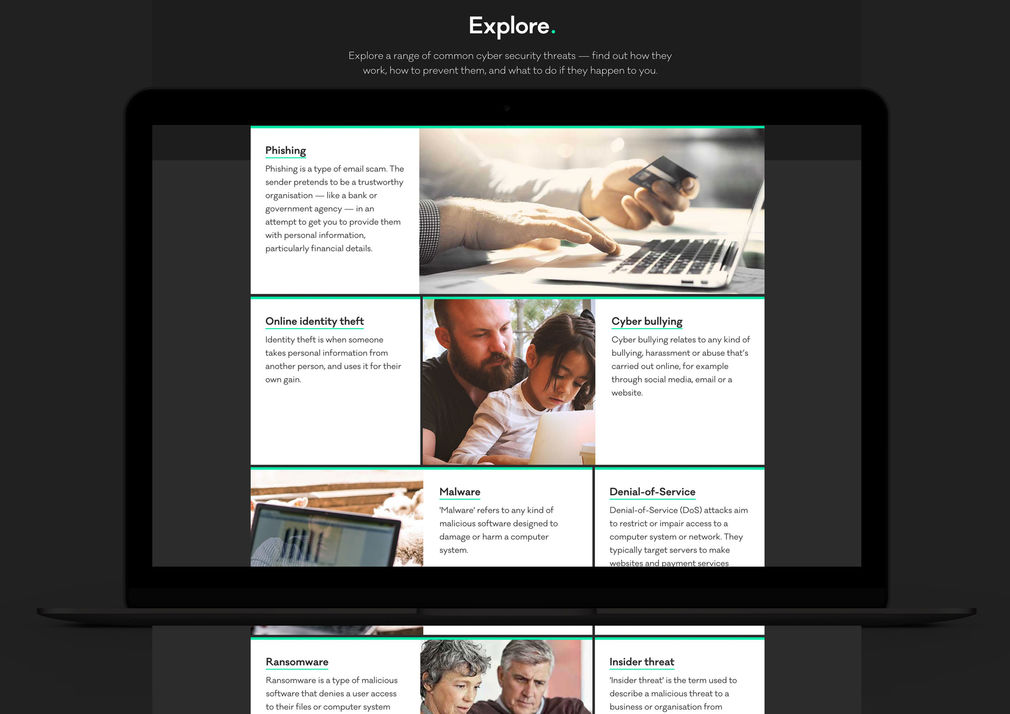
DNA presented an experience concept, focused on natural language, that essentially allowed people to provide symptoms and receive a diagnosis. CERT immediately saw the value in this approach. The natural language interface guides users through a series of contextual statements, using simple dropdown menus to complete, for example, an incident report. Because it requires no technical knowledge from the user, it makes it easier and more likely for non-professionals to complete an accurate incident report. This in turn allows relevant solutions and other information to be served to the user. IT professionals are taken through an interface that allows them to provide more comprehensive technical information.
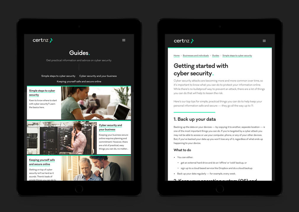
DNA’s approach placed the spotlight squarely on a real, urgent problem, and provided an intelligent and empathetic response that made it easier for users to engage. The progressive disclosure model underlying the natural language interface works brilliantly to guide the reader through, and the simplicity of layout brings clarity to the text-heavy content of the site.
DNA presented an experience concept, focused on natural language, that essentially allowed people to provide symptoms and receive a diagnosis.
Visually, the site’s sensitivity to typography and a strong understanding of hierarchy and content flow all contribute to an accessible and unintimidating user experience. The judges were inspired to see a brief taken to this level with a resulting outcome that is approachable, easy to engage with, never overwhelming, and user focused above all else.
Easterbrook Words & Ideas
-Mark Easterbrook
www.easterbrook.co.nz