City
Auckland
The Best Design Awards are a major feature of the local design calendar and some of last year's winners are touring the country to offer first-hand insights into their projects.
This event is brought to you by Resene
Alec Bathgate LifeDINZ
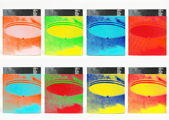
Hellzapoppin'! The Art Of Flying Nun Exhibition Catalogue
Bathgate Design were asked to create a low-cost exhibition catalogue reflecting the DIY aesthetic of Flying Nun Records; appealing to both fans of the label and gallery patrons.
This amazing piece of work captured the essence and the homespun attitude of Flying Nun, which is such an important part of New Zealand’s identity.
Luke Pittar PDINZ
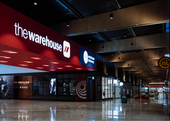
Customer-First Transformation
The Warehouse Group’s objective was to build Design Thinking capability right across the organisation, creating a collaborative framework for cross functional teams to innovate and align customer and business needs.
No easy task at this scale of organisation and the results over the last 2 years are simply stunning.
Their systemic and deep change across every part of the business, investing in time, fantastic tools and total commitment to upskilling everyone, is impressive.
Jef Wong FDINZ, Mike Pepper DINZ & Sinead Boucher
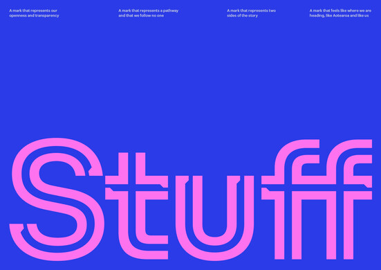
Stuff
Stuff needed a new positioning and identity to help illustrate and amplify their new direction – becoming more fearless, more imaginative and more human in every way.
Led by the idea of ‘follow no one’, and inspired by the creative drivers of Tūkaha (bold), Pōtiki (spirited), and Tiakitanga (for the People), Designworks developed a new brand that carves its own path to a contemporary future, while cherishing the past.
Putting the positive truths of traditional journalism at heart, while bringing them into a colourful, characterful and dynamic future – and always with purpose.
Joshua O'Neill, Andy Florkowski FDINZ
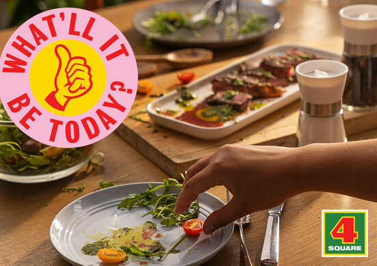
Value of Design - 4 Square
Graphics - 4 Square
Foodstuffs approached with a very direct brief – to refresh the brand and elevate the store experience to support changing consumer behaviours, the changing community needs, and reinject the 4Square DNA which has been diluted over time.
The goal was to both increase revenue, but also customer loyalty.
The design needed to be accessible for all members, so this would support more consistent and positive outcomes. The new identity needed to match that bright and positive sentiment, have universal appeal, and cut through in a crowded marketing environment.

