PURE Pākati
With this in mind Tourism NZ engaged the best team possible; a creative director from a leading agency, one of NZs leading font designers, a leading Māori creative strategist and a leading Māori artist and designer, and that team in turn engaged with both Māori and pakeha stakeholders with a view to identifying, distilling and creating a unique brand essence that could only be of this place.
Co-design hui and wānanga were used to identify that brand essence which was eventually distilled down to 'whānau' both as an expression of our identity as a nation, and how as kaitiaki we manaaki and embrace manuhiri as whānau.
The co-design team pursued this kaupapa drawing on both Pakeha and Māori design history and legacy to find inspiration with a view to evolving the 100% PURE brand through an authentic and elemental expression of our identity. A wide range of ideas were explored with early endeavours at 'adding' Māori design to font being overly busy and fussy - eventually the team distilled this down to a simple nihoniho pattern of three notches or 'taki toru' with its roots in the Pacific origin story of Whatonga.
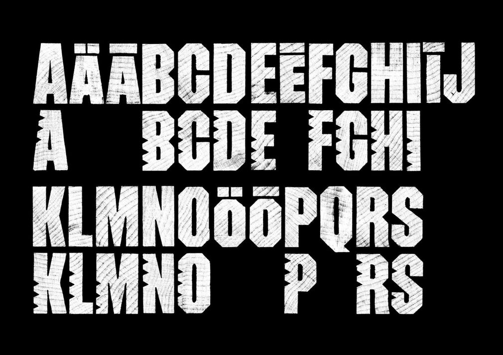
PURE Pākati / Taki Toru
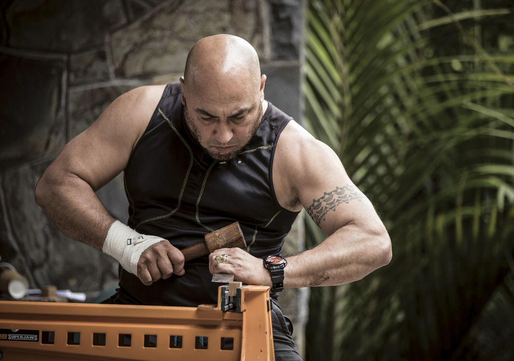
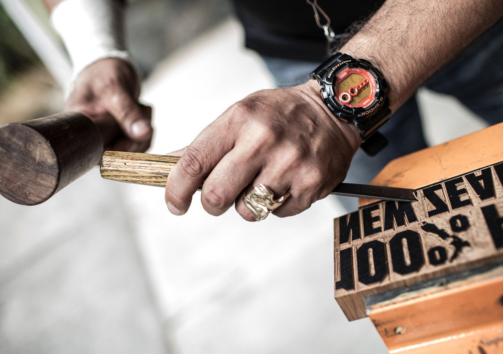
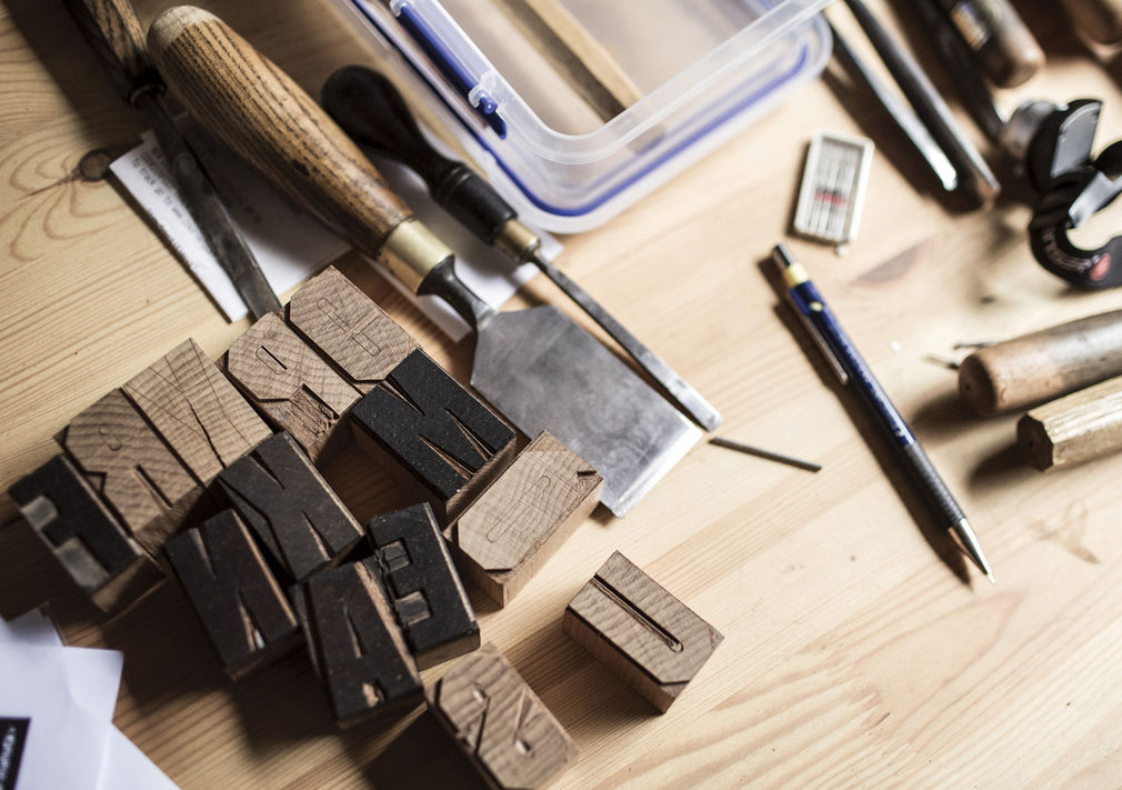
'PURE Pākati' has been developed as a bespoke font evolving the current 100% PURE font and merging this with the practice of whakairo rākau (wood carving) to produce a hand crafted and embellished font that can only be of this place - our place. The 'P_kati' or 'Dogs Tooth' notch has been carved into Kauri, a unique and prized native timber, to produce an absolutely 'one-off' design.
The Pākati is carved into timber type blocks in a recurring pattern of three notches, or 'Taki Toru'. These three notches are symbolic of the kaupapa of 'embracing visitors as whānau' as expressed in the story behind Taki Toru. In Māori Culture there are many stories as told and ascribed to by different Iwi, hapu and whānau. In some iwi the Taki Toru could be described as representing three stages of the Māori Creation Story; Te Kore (the nothingness), to Te Po (the night) and Te Ao Marama (the world of light / living), or similarly Ranginui (the sky father), Papat__nuku (the earth mother) and Te Ao Marama. In this particular instance inspiration was drawn from the whakapapa korero (story of origin) of Taki Toru coming from a story of Polynesian migration from the Pacific, through the story of Whātonga, a common ancestor to a number of Iwi on both the eastern and western sea boards of NZs North Island.
The story speaks of the affection between whānau members, in this case between Toi (Toi Kai Rākau aka Toi Tehuatahi) and his grandson Whātonga. Whātonga and a companion, Turahui, had been taking part in a waka (canoe) regatta at Pikopikoiwhiti lagoon in Hawaiki, when suddenly a storm blew them out to sea. Filled with anxiety and determined to find his much-loved grandson, Toi set out in search of his mokopuna, making the perilous journey to Aotearoa.
Story has it that in desperation and through his love for Whātonga, Toi bound a rākau with three lashings and set it adrift hoping it would reach Whātonga following the currents and winds that had blown Whātonga out to sea.
The three lashings posed three questions that Toi knew Whātonga would understand; Where are you, how are you, and when will you be back? This simple gesture speaks of the sentiment of care and concern for loved one on their travels.
As it turns out Whātonga journeyed to and settled in Aotearoa and the stories of him and his descendants are etched in numerous place-names in Aotearoa, such as Te Whanganui a Tara for Wellington, named after his son Tara. In some accounts of the story Toi also pursued Whātonga and arrived in Aoteroa as well. In some accounts it is Whātonga who pursued Toi to Aotearoa.
The story of Toi and Whātonga also connects to the origins of whakairo rākau (wood carving), as one story of the origins of carving is that it arrived from Hawaiki with Whātonga's brother Rauru (both Whātonga and Rauru were sons of Ruarangi - Tois' son, and Rongoueroa). Rauru had three fingers and some attribute the appearance of three fingers in carvings of human figures as originating from the image of Rauru.
This 'Taki Toru', or three-element design, is a recurring theme within whare whakairo in carved, woven, lashed and painted form. Taki Toru is often seen in lashings on and behind the heke (ribs), or painted rafters, of the carved whare tupuna (ancestral house).
So, the key defining visual element of PURE Pākati is Taki Toru as expressed through three notches. As with the whare, Taki Toru can be expressed and recur in different ways in different elements, and this is reflected in the 100% PURE rebrand where Taki Toru is not only a defining element of the 'PURE Pākati' font, but is being used as a defining element in a variety of brand elements to identify them as part of the 100% PURE brand whānau.
Rauru
A unique 'tohu', or symbol, has been developed to accompany the font as another brand device based on the double spiral known as 'Rauru' or in some variations referred to as 'takarangi'.
We have settled on referring to the tohu design as 'Rauru' as it not only denotes the visual form, but is also provides a whanau connection to the story of Toi and Whatonga.
The Rauru double spiral design represents both journeying and the embrace of two elements around a central space of energy. In terms of Journeying, the Rauru double spiral represents a journey in to, and out from, the centre - which can be viewed in a literal and metaphorical sense.
In regard to the notion of the embrace of two elements and the energised space between them, this can be related to the creation story based on the separation of Ranginui (the sky father) and Papatuanuku (the earth mother) and the creation of Te Ao Marama (the world of light, living and enlightenment) between them - in the same way that tourists have immersive and engaging experiences in Te Ao Marama between the embrace of sky and earth - the idea of visitors being embraced between earth and sky, or equally being embraced between tangata (people) and whenua (the land).
The finished work is a typeface and accompanying tohu made by many hands to highlight the best of our design and fine arts traditions from a Māori and Pāheka perspective simultaneously, whilst giving life to the kaupapa of 'embracing visitors as whānau'.
—Andrea Stevens
www.folio.nz