Each week the Designers Institute will release a case study on a Best Design Awards 2019 Purple Pin winner
– a project description in the words of the designers along with a short interview with writer Mike Barrett.
Purple Pin Case Study — Moving Image
BUCK
Power to the Pro
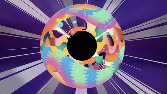
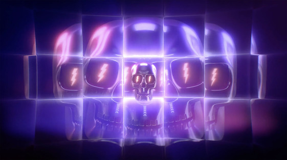
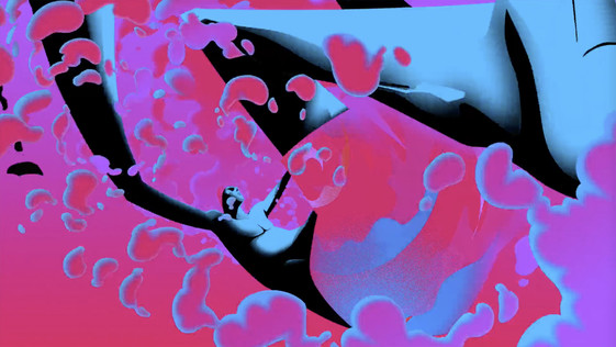
Moving Image: Power to the Pro
Studio: BUCK
Project description
For this film, we used our creative process as the basis for the piece, including many of the styles, techniques, and POVs that represent us as a diverse group of collaborating artists. The whole piece is a mashup of vignettes, each representing the personal style of one of our artists.
Beginning with the inception of an idea deep inside our collective minds, we see its evolution as we pull back through an exploration of style, techniques and metaphor. We transition between scenes with increasing speed until finally culminating in an explosion of possibilities and visual radness.
Because we wanted to showcase the diverse skill set of our artists, we employed as many different styles of image creation and animation as we could, from slick 3D and generative particles to frame by frame cell animation, table-top stop motion and 2.5D. We used a simulated continuous camera pullback throughout the entire piece to transition from scene to scene, but the biggest challenge, besides weaving all the styles together, was coming up with an animation technique that allowed us to move through a lot of content very quickly without using a fast moving, flying camera.
We came up with a technique we call object permanence, in which we wipe over an object in one scene and it becomes a different object in the next scene. We ramp up the use of the technique until, for the last 10 seconds, it happens every frame (internally, we called this “the eyegasm!”).
Gareth O'Brien, BUCK and Matt von Trott FDINZ, Assembly and convenor Moving Image at the Best Design Awards
Q&A
Mike Barrett talks to Gareth O'Brien, executive director, BUCK
Skulls, afros, bombs, bikes, a black hole vacuuming up all sorts of animation. That's just a few themes from a pretty intense 56 seconds! Was there a brief? Did you have to sell a concept to Apple, or did they give you free rein to do whatever?
The brief from Apple was simply to make something badass using the iMac Pro. This is our favourite kind of brief, and they don’t come around nearly as often as we would like. We wanted to find a way to engage all of the talented artists in the BUCK collective. After throwing ideas around in early brainstorming sessions we settled on the meta concept to make this a piece about our creative process.
Creating collaborative art is sort of our wheelhouse. Yes, we do all kinds of work, but we built our creative engine around large-scale collaboration. We feed off each other — inspiring and pushing each other to exciting new places. When we get into the groove, we meld into a powerful hive mind whose only weakness is our render times.
Have you worked with Apple before or since? What's it like working with them?
If we had done a bunch of award-winning Apple work over the years but were under NDAs to not talk about it, we would be unable to go into greater detail about the collaborative process. That said, we have a great relationship with Apple. We love working with them. Hypothetically-speaking.
You guys have three offices and, on your website, a very long list of team members. How many people and from where worked on this project, and what types of contribution did they make?
We drove this job out of our L.A. office with a core team of a dozen people. But as the meta concept took shape and we decided to make this about our own creative process we called on the talents of our entire roster in all three BUCK offices. Everyone contributed a moment to the final piece — there are well over two hundred keyframes in the edit that are specific to the styles of individual artists here.
Can we talk about this wonderful term, the 'eyegasm', as well as object permanence? What are the advantages when you're stitching together something as diverse as this into a cohesive edit?
The term 'eyegasm' was coined by creative director, Steve Day. The challenge of this piece was capturing the excitement of the creative process — when you’re firing on all cylinders and you’re trying to get it all down, how do we capture that feeling? How do you make something that feels overly abundant but not overwhelming? We wanted to explore the tension there, skirting right up to the line of this visual event-horizon.
The whole piece is one long pullout that follows the evolution of an idea from inception through the creative design process to an explosion as the idea takes on a life of its own. Since the pace of the edit grew exponentially, we used a permanent shape in the center of the composition as our anchor to give the eye a place to rest and focus while the rest of the frame was working overtime to melt your brain.
We first animated the persistent shapes – squares and circles, etc. – collapsing towards the center of the frame as the camera moved back with increasing speed, then, in a process developed by creative director Kendra Ryan, we designed the scenes on top of that wireframe animation giving it that silky-smooth transitiony feel.
Can you give me a kind of vibe for a Buck office? I read once that for the people of BUCK, working for clients is like an extension of art school. Is that accurate?
BUCK has always been a family. But in the past few years, as our ranks have swelled; maybe the better analogy for the BUCK vibe is more akin to a specialised summer camp. Like some emo art kids or some Space Camp nerdos, we’re super-focused on our work. But, when we play, we play hard. Dodgeball archery is not out of the question. We have a diverse, international staff. Over two dozen languages are spoken here. It’s a good atmosphere to create great work.
The art school analogy is interesting, I haven’t heard that. But we do spend most days exploring and deconstructing design principles so from that perspective, it definitely is like an extension of art school. But we have better coffee.
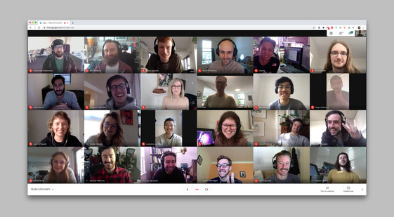
Screenshot of the BUCK Sydney team.