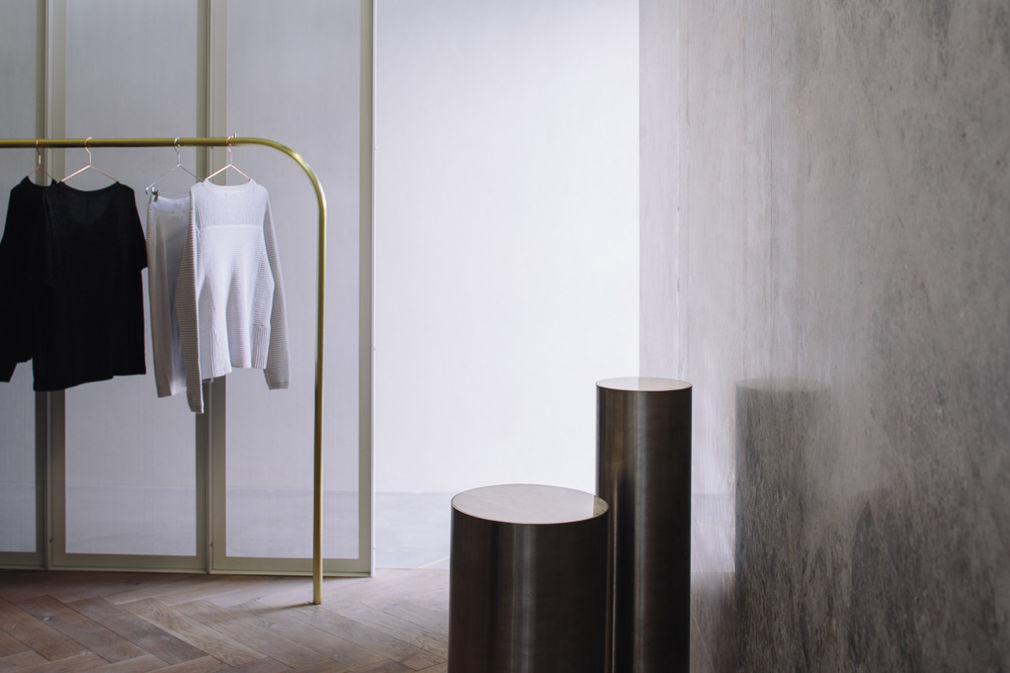
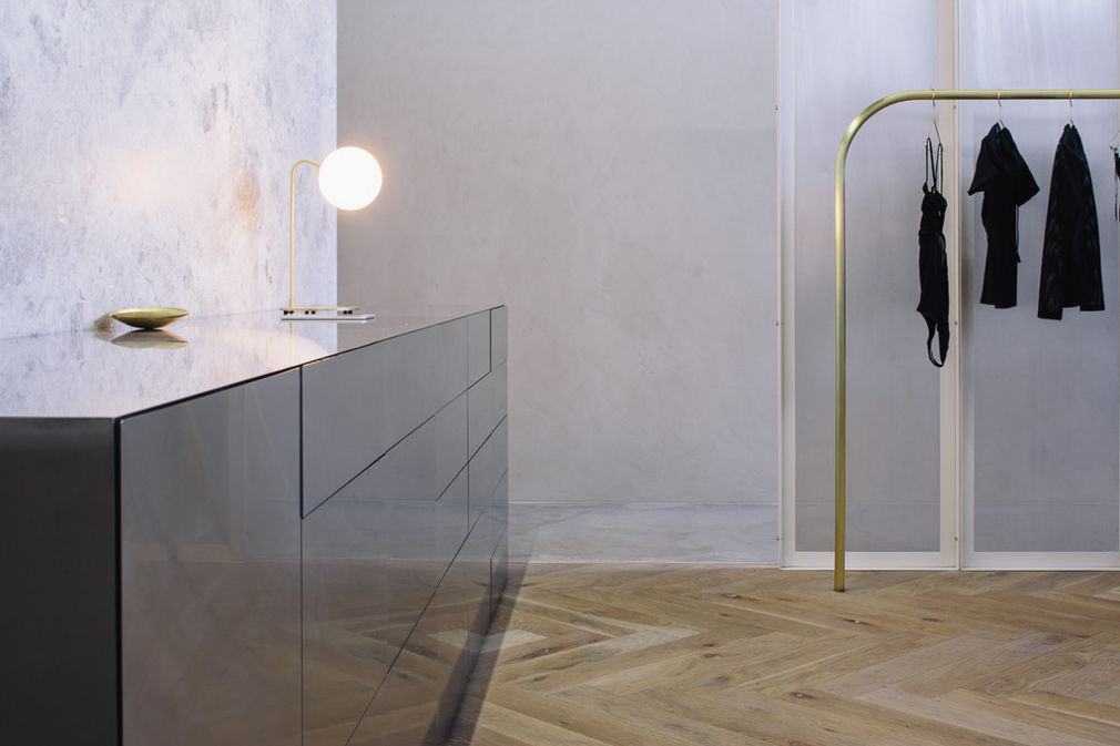
Lonely's flagship store in Ponsonby is the first physical retail space by the womenswear label known for garments made for comfort as much as looks. For a company that likes to do things a little differently, it was no surprise to see them upend retail conventions with this exquisite private 'dressing room' designed by Rufus Knight.
Purple Pin Case Study — Spatial
Knight Associates
Lonely Ponsonby
Background


Established in 2002 by Helene Morris and Steve Ferguson, Lonely quickly established a loyal local following, but became a global brand after it launched its first lingerie collection in 2009. Through an arts-based approach to marketing imagery, Lonely displays a refreshing celebration of diversity within the highly commercialised world of women's clothing design. With honest and intimate portraits of women wearing Lonely lingerie - along with their ethos 'no padding, no push-ups, no G-strings' - the label gained a reputation for beautiful, intimate designs in which practicality and comfort definitely came first. These portraits, published as an ongoing photo essay, have not only defined Lonely's success, they describe the essence of the brand and have informed its interpretation into a three-dimensional space.
“Privacy, intimacy, softness, beauty, curiosity, simplicity … these were all words we used to describe not only the feelings that we wanted to evoke, but also the material and colour palette,” explains Ferguson. “Our brief was all about providing a beautiful customer experience - a journey that was thoughtfully designed to ensure the customer really felt special and cared for our way.” The interior translates the values that inform their garment design, by blending comfort and function with elegant forms and materials.
Interior designer Rufus Knight (in association with Fabricate Architects for contract documents) had known Lonely from the start, “so translating the candid and sincere images of Zara Mirkin, Petra Collins, or Harriet Were felt really intuitive,” reflects Knight. “The space had to create layers of intimacy focusing on the customer and their experience, so the process and conditions for buying clothing and lingerie - confidence, privacy, and warmth - were essential.”
To do this, they had to flip retail convention on its head. There are no images or graphics in the store, no window displays or sales counter. They have removed many of the barriers that might otherwise interrupt a connection with a customer, so that it feels less like a retail store and more like a private consultancy room. For example, without a fixed point-of-sales area, the focus is taken off the transactional nature of the retail space. With the use of a tablet, a sale might happen anywhere in the store a conversation can take place, so that selling becomes a fluid part of the experience and not an end to it.
While functionally the store removes many of these traditional retail elements, visually it also plays with the rules to create a more intimate customer experience, firstly by screening itself from the street. From the footpath, the interior is shielded by a large wall of grey marble, with the simple lettering Lonely engraved onto it. Garment display is inside, past this layer and a second layer of aluminium mesh screening, with the spatial detail mirrored on the opposite side of the store. The mesh screens create a layered, dreamy space and lead down to the dressing rooms, which are shielded behind a second marble wall. The whole scheme creates a very calming and satisfying symmetry.
Material and texture are key in evoking a soft and warm ambience. Conceptually, Knight, together with Hamish Stirrat of Fabricate Architecture, explored the idea of 'soft industrial' - robust materials made soft and tactile through their finish and contrast. Rough salvaged timber is laid in an ornate parquet floor pattern, the classic grey marble has had its cold sheen removed by sandblasting, and the industrial aluminium mesh has a delicate perforation. The soft textiles of the garments, and blush-pink linen curtains in the changing rooms, further accentuate by contrast the industrial character of the main materials. The spirit of the space supports the ethos behind the garment design, where comfort comes first, supported by a soft but assured aesthetic.
“Stepping from street to boutique is to be transported into an intimate and sensual experience,” commented the award judges. “The rich materiality has a painterly quality, the detailing is masterful and the manipulation of light creates an almost other-worldly experience.”
—Andrea Stevens
www.folio.nz