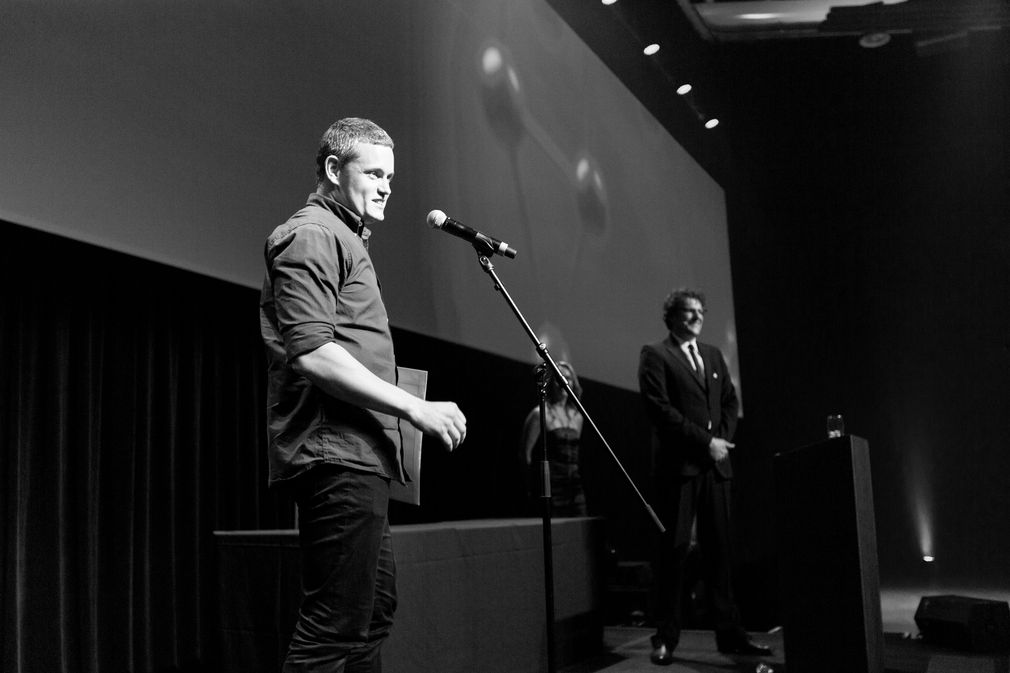
Kris Sowersby works in a singularly solitary profession, and yet has achieved world acclaim for his craft. He is a thoroughly modern designer who has helped to redesign one of the most traditional of British newspapers.
While it may seem to be an unusual craft in this digital age, people like Kris have reinvigorated the art of type design. He has been described by admirers as one of the leading rock stars of type design because he combines historical knowledge with rigorous contemporary workmanship and finish.
Kris is a graduate of Whanganui’s School of Design, and after graduation spent three years teaching himself to design typefaces. His first retail typeface, Feijoa, was released internationally in 2007, and his second, National, won a certificate of Excellence from the Type Directors Club of New York. Since then he has received two more certificates of Excellence. Kris is a member of the prestigious Alliance Graphique Internationale, he has been honoured by the Art Directors Club and this year won the Judges Choice in the Type Directors Club awards, for his Domaine Sans typeface.
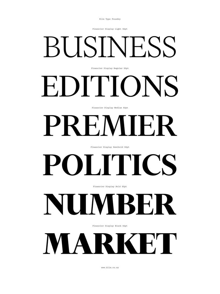
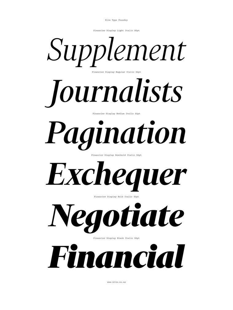
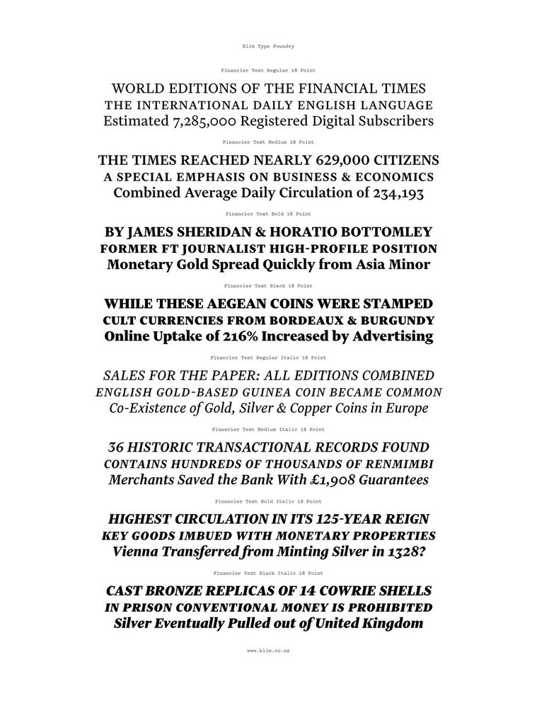
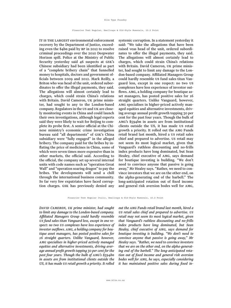
Clearly, as can be seen by the commission from the Financial Times, Kris has achieved international acclaim at a relatively young age. Despite the antisocial time difference, Kris spent some months working on a new typeface for the new design of that august organ, the Financial Times, which has been widely praised by its readers. The typeface was aptly named Financier.
“The reaction of readers to the font has been very positive. In focus groups, readers typically described it as “elegant, distinctive and more attractive to a modern readership.”
Kevin Wilson, Head of Design for the FT, said the newspaper specifically wanted type that wasn’t a traditional news typeface. He said “We wanted the typeface and redesign to have a considered personality to match our style of journalism, which is our strengths in analysis and comment.
