Somewhere in the vicinity of 34,000 children visit the Starship Children’s Hospital emergency department every year, and, when they do, the assessment area and waiting room is usually where the patient journey begins. Despite the competence and kindness of staff at Starship, patients and parents or caregivers can be understandably anxious or unsettled. On this project, the objective was to find new ways to enhance the emergency department experience, to calm children and prepare them for treatment, and create a more accommodating and confortable patient space.
Purple Pin Case Study — User Experience
RUSH Digital and Watermark Creative
Starship Animal Check Ups & Magical Forest
Background
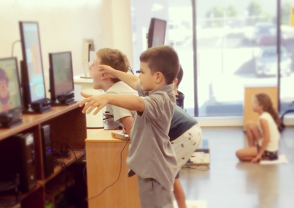
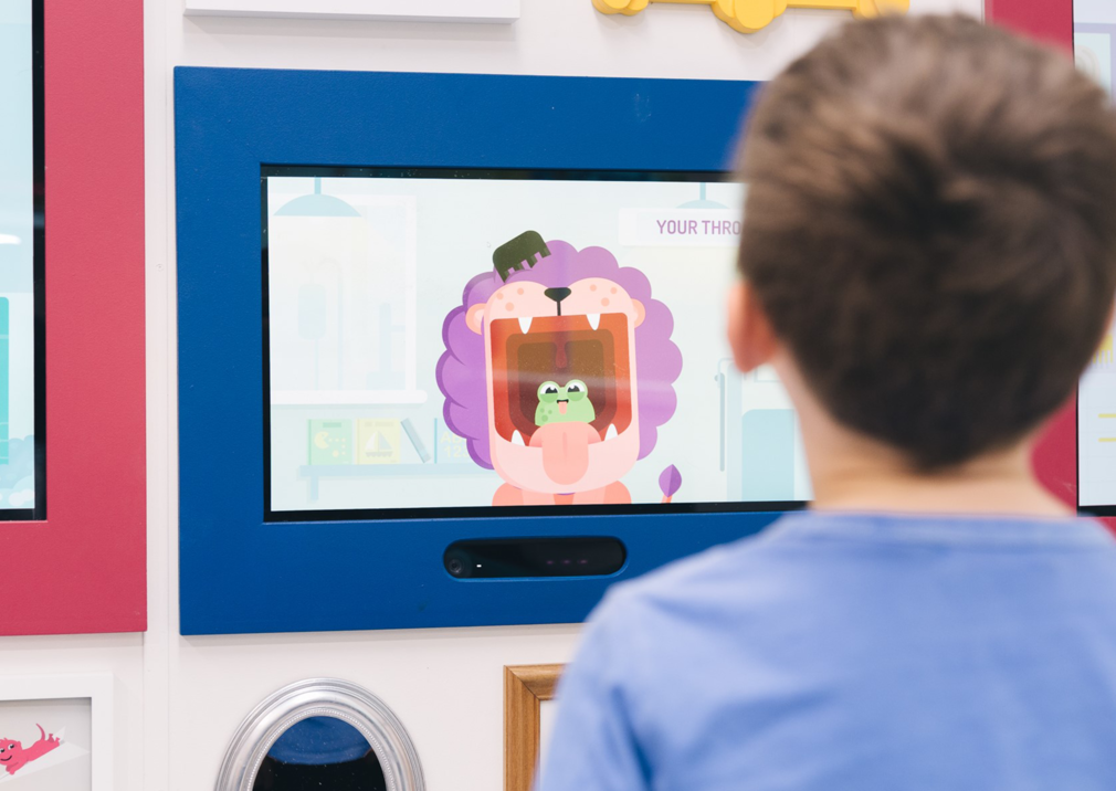
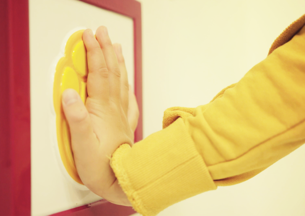
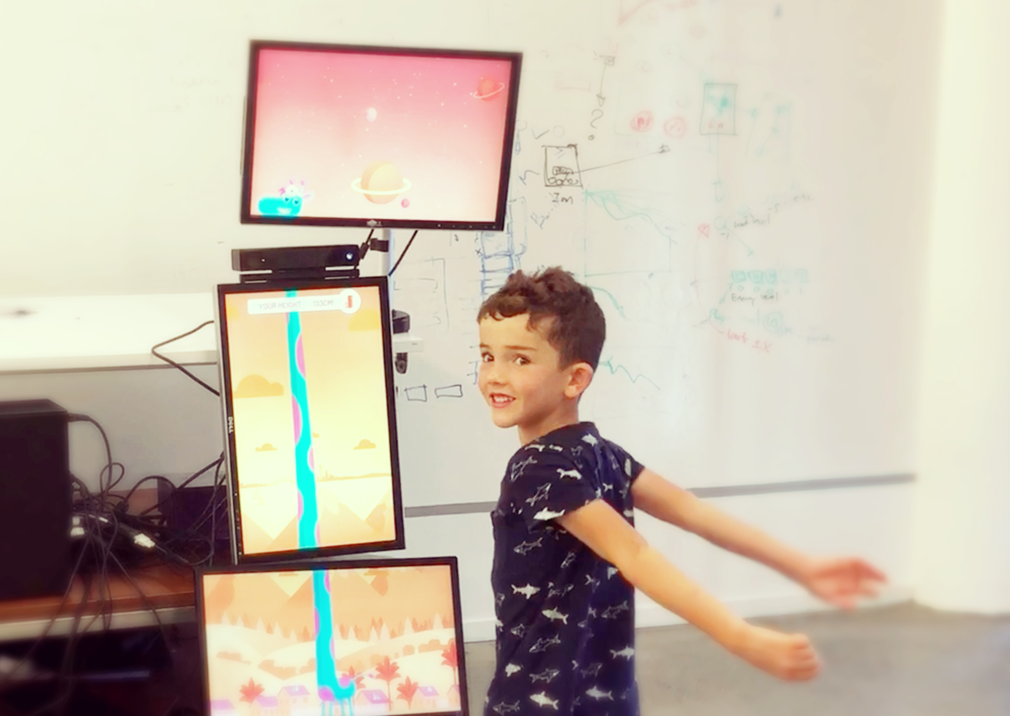
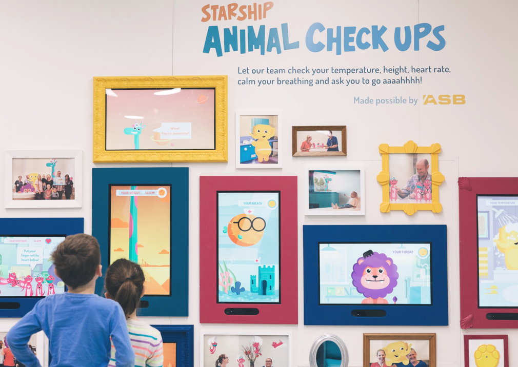
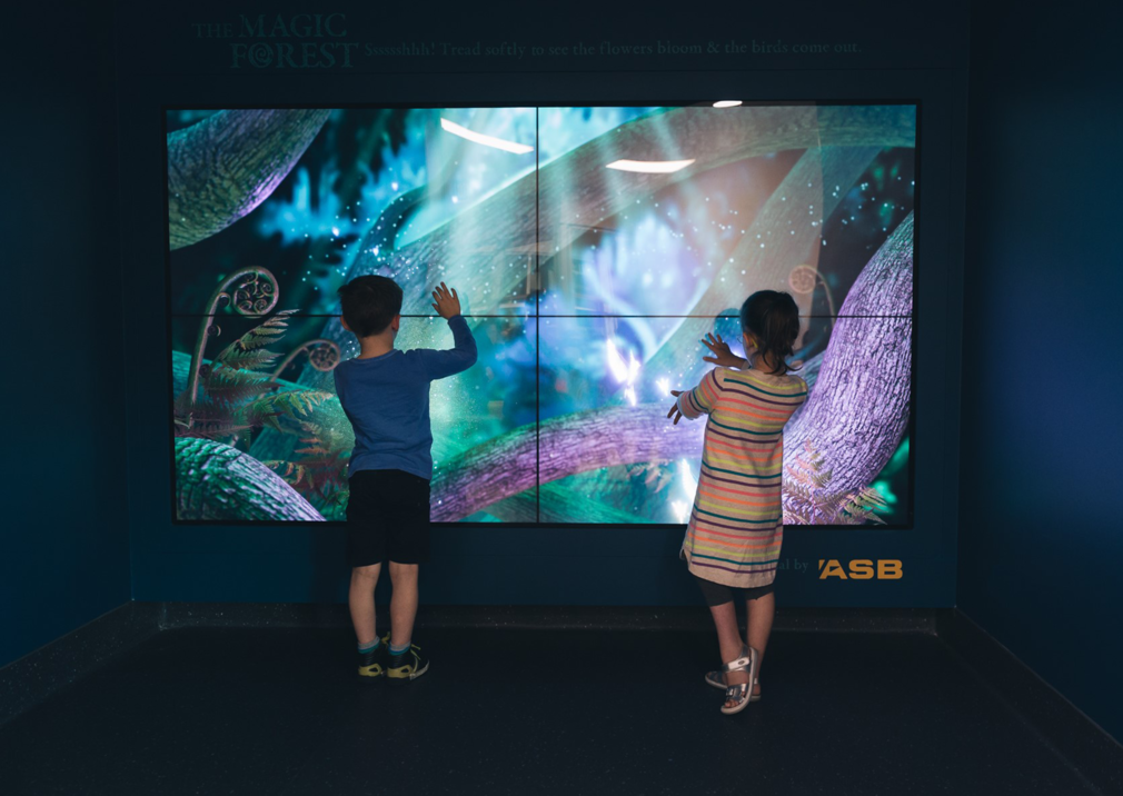
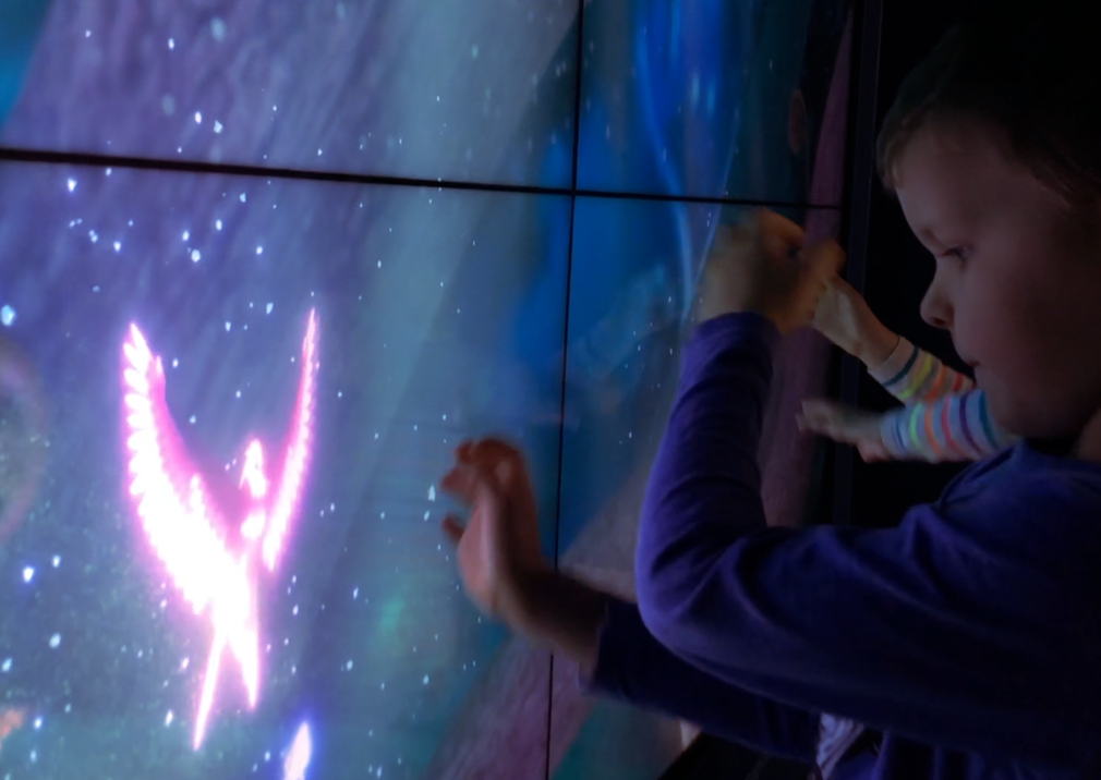
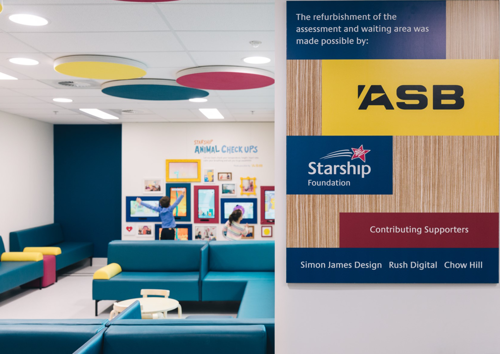
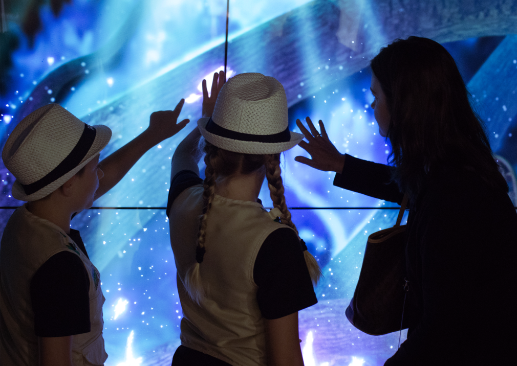
To achieve this, two different experiences were developed.
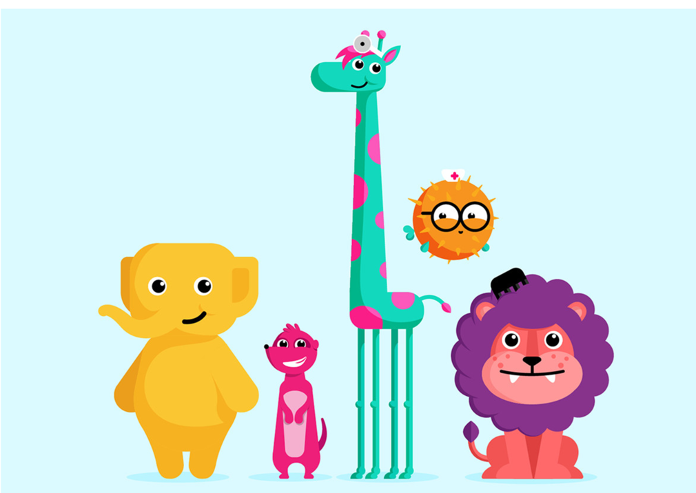
The Starship Animal Check-ups space was the first: a picture wall, like you might have at home, that comes to life with animal nurse and doctor characters that familiarise children about the check-up procedures and processes they will undertake. It’s interactive; lions teach children to open their mouths wide; meerkats read heart rates; blowfish coach breathing – all are experiences are controlled by proprietary sensors and interactive computer vision-based tracking system.
The Magic Forest, the second experience, is a window into an enchanting, tranquil world. As children become calm in the forest the environment reacts; virtual flowers blossom and are pollinated by virtual birds – move too quickly and they’ll be scared off. The animations are rendered in real-time 3D, using a mix of custom graphics shaders for the Magic Forest and fluid 2D Spine animation for the Animal Check-up wall.

This project demonstrates a human-centred design approach built upon empathy. It’s the sort of design that can only be informed by behavioural observation of patients and information gathering from specialists.
Of course, the human-based information strategy needed to be paired with a seamless digital solution. The design team went through three different “fidelity levels of testing”. Technology options, sensors, visual displays and vision platforms were trialled, including custom temperature and heart-rate sensors, with a heavy reliance on computer vision and machine learning, facial landmark detection and tracking, depth sensing and full body skeletal tracking. Low-fidelity presentations of the experiences were then implemented to see how children and parents acted and reacted, with high fidelity “faked environments” then tested “to see it all come together prior to installation”.
It’s fair to say that few projects have the KPIs of this one:
“To create smiles in distressing situations”. And that’s not a throwaway line – the designers say that the technology implemented is “continuously tracking the number of smiles and the duration, so we know if we are having the impact we designed for”.