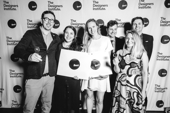
Each week the Designers Institute will release a case study on a Best Design Awards 2019 Purple Pin winner
– a project description in the words of the designers along with a short interview with writer Mike Barrett.
Purple Pin Case Study — User Experience
Sharesies
Sharesies

Sharesies
Project description
The share market is hard, isn’t it? Too many barriers to entry – disposable income in large amounts, an NBR subscription, the ability to interpret the business section fine print, a broker. Bricks and mortar; that’s what Kiwis invest in; if they can afford to, because, as is well known, there’s a high barrier to home ownership too.
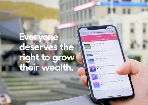
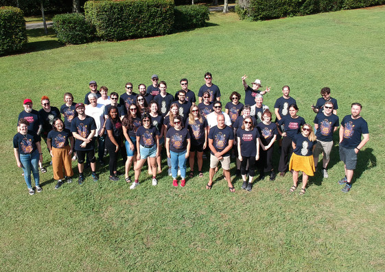
The inventors of Sharesies, an online investment platform, thought about this and said, well, actually, there’s got to be a way to get Kiwis investing. In their words, they are empowering a generation, by design.
The first step of founders Ben Crotty, Brooke Roberts, Leighton Roberts, Martyn Smith, Richard Clark and Sonya Williams was to interview 100-plus people about their lifestyle goals and their attitudes investing. Most respondents, they discovered, had a negative attitude to investing. They felt jargoned out – even if they’d decided to invest, it wasn’t approachable for the first-timer; priced out – there were minimum amounts (from $250–$10,000 per trade) that were needed to invest; and branded out – people didn’t relate to financial services because they targeted the wealthy few.
A longer survey followed. Four thousand people validated the conclusions of the first 100. They also helped Sharesies’ purpose: “To create the most financially empowered generation. To provide someone with $5 with the same investment opportunities as someone with $500,000.
They would do this through an accessible platform that created the investing experience from scratch, removing the barriers. By building confidence by focusing on education and learning by doing, and by showing people that it’s ok to talk about money through blogs and events. And by creating motivation, turning something that in the past been linked to guilt and shame into something fun, engaging and inspiring.
The Beta road to investing
Sharesies’ founders started prototyping a way for people to invest online using low-fi prototypes, tested with customers, gaining insight and refining it as they went. In May 2017 they lunched a private beta version of the software, and 3,000 people signed up and started investing. Over seven weeks, 10,000 trades were made across six ETF funds.
They learned and iterated, launched a public beta in July 2017 and dropped the beta label in April 2018. That hasn’t meant that testing has ended. Since launching, they’ve continued to gain customer insight through survey responses, in-person usability tests and unmoderated online usability tests and customer interviews.
From the behavioural data analysis of 20,000 conversations between customers and customer care they have made significant upgrades since launch.
They’ve launched kid’s accounts for under 16s; refreshed the brand identity; fractionalised shares and added to the range of investments, from six funds to 26 with a focus on social and environmentally responsible funds and the ability to invest directly on the NZX.
Since June 2017, the results are impressive. More than 50,000 investors have invested more than $62 million, with 79 percent of customers younger than 40 years, the majority aged 24–40, and several investors aged 80 plus. There’s also a 50/50 split between male and female investors, and most investors are new to investing.
All-in-all, you have to say that this platform is going a long way towards changing investment culture across a broad swathe of New Zealand.

Q+A
Mike Barrett talks to Ben Crotty, Design Chief, Sharesies
Hi Ben, so, who spotted the opportunity to create a more accessible investing platform?
The idea for Sharesies came about in October 2016 after we noticed that it was becoming too hard for people to grow their wealth. The typical investment in New Zealand was property, and with house prices rising this was becoming further out of reach. Investing in anything outside of property was too hard.
There had to be a better way, and a way for people starting-out to develop their wealth.
Sonya (Williams) and I are partners – we always had that feeling we could be doing more with our money, before Sharesies the only person I knew who invested was my grandpa. He’d told me about how he’d taken night classes to learn – which got me thinking, “Ah right, that’s how to do it”, but I'd put the concept off as on being too hard.
One night, Sonya had the idea to make it easy to invest, online, with small amounts, in a fun way. From there, a group of seven of us from a range of diverse backgrounds got together and decided to make it our mission to give someone with $5 the same investment opportunities as someone with $500,000. Now we have a platform that offers the ability to invest in the NZX and a range of managed funds – from one cent.
Do you feel like you were taking a risk with Sharesies? Like you say, New Zealanders are typically portrayed as bricks and mortar folks.
It’s true that when most Kiwis think of investing, they think of property – only 20 percent of Kiwis have shares. And this is mostly 60-plus year-old men living in Auckland. But rising house prices created an obvious problem for those excluded from the dream of home ownership.
After doing six months of customer validation we learned that people did want to invest, but current investment structures required too much money.
There was also too much jargon, and there wasn’t really a product that suited their needs. This made us feel confident that if we focused on our customers by helping build access, confidence and motivation to invest, then we could help share opportunities to grow wealth for all Kiwis.
Since launching we have more than 87,000 Kiwis investing on Sharesies.
Together, they’ve invested over $150m dollars.
With respect to the UX, it really is a cinch to sign up and get started. I've had a go. I imagine, however, that behind the several regulatory and compliance challenges and all manner of other challenges are sitting in the back somewhere.
What were the main challenges you faced putting it all together?
Yes, and, thanks! Finance is a heavily regulated industry, but for good reason, to keep people protected.
Early on we met with the regulator, the Financial Markets Authority (FMA), and talked to them about what we were trying to do, this helped give us an understanding of the key problem areas.
The key challenges were factoring these into the UX in a way that met the intention of the regulation but felt relevant and engaging for our customers. This included making sure we were meeting our anti-money laundering requirements, processing tax, making sure people understood investment risks.
Great design is about solving problems, so these were never show-stoppers for us. We got through it with a tightly aligned team using a sound values-based methodology.
Our general attitude is to do as much heavy lifting as possible for our customers and create elegant solutions.
So, on a scale of 1–10, how challenging is achieving all this?
It ebbs and flows. We design our way through, from product feature launches to people experience. We’re passionate about the problem we're solving and who we’re solving it for. We spread the workload across different team members; everyone is a leader with a part to play, and ownership of their role is important.
Having said this, we believe no-one should go home owning a problem with "heavy-shoulders". It just feels nicer smashing through goals together.
I'd imagine that a rare challenge of the identity was conveying the ease and accessibility required to draw people in alongside the security, confidence and credibility required to present financial security.
How did you approach this?
Yes, definitely, and it’s a sliding scale, it needs to be engaging and feel relevant and non-threatening to give it a try, but also trustworthy because you’re investing your money online and you need to trust who is offering that service, and that they take these things seriously – which we do.
We’re audited five times a year.
It's designed fit-for-purpose, with personality.
There are times when we push colour and type more – giving more energy where needed, and times when we focus on making a usable tool with more subtle flair to aid clarity.
We follow our design principles when we’re solving problems.
You undertook quite significant crowd testing and data analysis on the way to the finished product – were you surprised by any of results of this research, or did you have any preconceived ideas challenged?
We definitely invested heavily at the start to help us understand our customer before getting too "invested" in the solution. And continue to do this as we grow, which helps keep preconceived ideas or assumptions in check.
Before launching, the only thing we couldn’t test was whether people would actually invest, and that they’d keep doing it over time – which we can only really look back on now and say that this is happening.
Since then we’ve been surprised by all the different investment styles.
People really invest in their own unique ways; from small amounts every day, to bigger lump sums and letting it sit there, which is always fascinating.
What are your next moves?
Where do you see yourselves in 3, 5 or 10 years?
We’re on track to financially empower a new generation.
As of right now, we’re proud to be witnessing changes in the financial industry as companies realise it’s a good thing to be relevant, to help people, to build a better world.
We’ve got our sights on growing in New Zealand, offering more investment types, refining the investment experience, and considering overseas markets, to give more people access to the Sharesies experience.
At the time of publishing (May 2020) we’ve hit 152k customers and $400m invested.
