City
Auckland

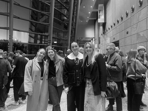
The Best Design Awards are a major feature of the local design calendar and some of last year's winners are touring the country to offer first-hand insights into their projects.
This event is brought to you by Resene
Purple Pin - Graphics
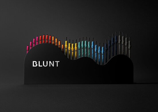
Blunt - Ben Reid, PDINZ & Anthony Hos, DINZ, Milk
Blunt umbrellas are an award-winning iconic Aotearoa New Zealand product. Beautifully designed, they are a true kiwi innovation. To grow the brand into new international markets the Milk team, Ben & Anthony, worked with Blunt on new design principles of reduction, beauty, confidence, and joy.
Purple Pin - Digital
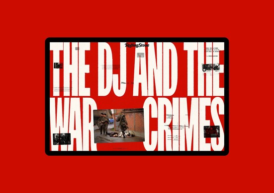
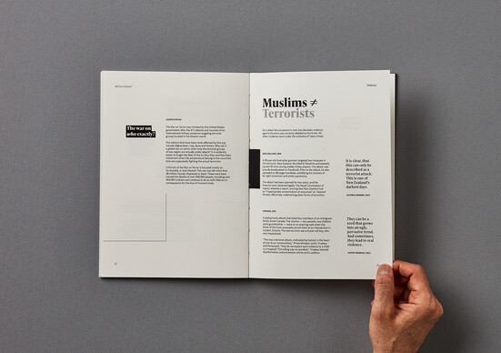
The DJ and the War Crimes - Tarver Graham, DINZ, Gladeye
“The DJ and the War Crimes," is a digital storytelling site for Rolling Stone and The Starling Lab. It forensically retraces a war crime by a Serbian paramilitary group in Bosnia during the 90s. The impact of this project was resounding. It received over 150,000 visits and thousands of tweets on launch in an era where trust and truth are more important than ever.
Purple Pin - Moving Image
Kathmandu - Summer Never Sleeps - Lisa Fedyszyn, Jolene D'Souza, Jonathan McMahon & Daniel Warwick, Scoundrel
Kathmandu has historically been associated with winter. Special needed to reposition them as a lifestyle brand for all seasons. Overall, the effect was a unique world, that would completely redefine how Kathmandu was perceived as a brand.
Purple Pin - Value of Design
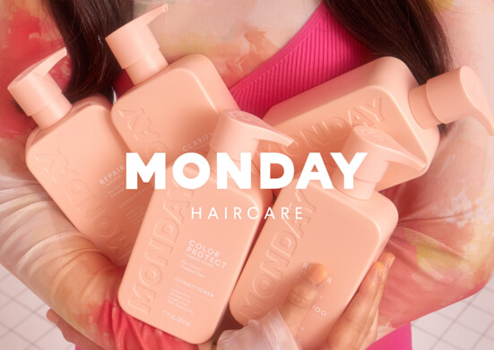
MONDAY - Monique Robins, ZURU Edge
Monday is a brand that has hit all the megatrends and sales targets around premiumization and affordable luxury - giving their target audience something to love and share with its super relevant and fresh feel.
Leaning on strong product design, Mondays packaging has been optimised for distinctiveness, colour blocking and smart thinking around impact. They have demonstrated to all of us what's possible from Aotearoa New Zealand. Challenging the biggest FMCG companies in the world, cutting through with bold branding and making it more affordable for young people to have more good design in their life.
Gold Pin - Student Graphics
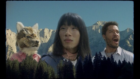
Will You Notice? Will You Change? - Aakifa Chida
Islamophobia exists everywhere. In every community and every country. Cultural and religious minorities are often mistreated, wrongfully judged and discriminated against.
This project uses communication design to impact, encourage and influence social awareness around Islamophobia through printed and digital resources. Design activism is employed to address negative behaviours and attitudes, to create change by catalysing a sense of empathy with victims and heightening responsibility and accountability within viewers.

The Best Design Awards are a major feature of the local design calendar and some of last year's winners are touring the country to offer first-hand insights into their projects.
This event is brought to you by Resene
Purple Pin - Spatial
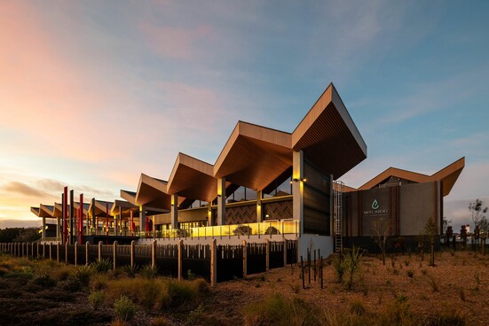
Wai Ariki
The brief was to create a luxury wellness facility like no other – architecturally, experientially and culturally – to provide ongoing value and future opportunity for Ngāti Whakaue members and the local community. The development was funded by Māori, to be led by Māori, and benefits from being compiled through the lens of Te Ao Māori.
Gold Pin - Spatial, Emerging Designer
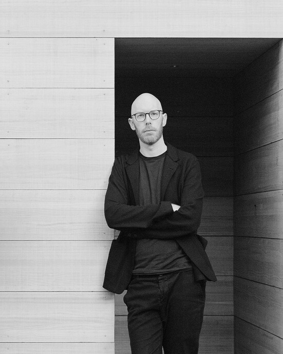
Thomas Seear-Budd - Thomas Seear-Budd
In 2019 Thomas, alongside his business partner James Ross, established Seear-Budd Ross, a design-focused architecture and interiors studio. In four short years, Thomas has delivered a collection of projects across the country, from private residences and cafes to retail offerings and furniture pieces.
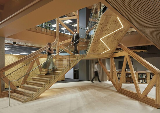
Gold Pin - Repurposed
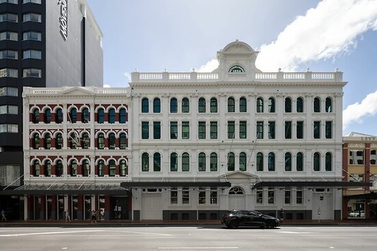
The Hayman Kronfeld Building - Richard Goldie
Britomart developers Cooper and Company have been refining the refurbishment of heritage buildings for almost two decades. The brief was to amalgamate two heritage-listed warehouses, the ‘Sofrana Barrington buildings’, into a contiguous 1000m2 floorplate ‘Grade A’ (PCNZ) office building with ground floor retail, an office lobby, and three floors of character office space.
Gold Pin - Repurposed Spaces
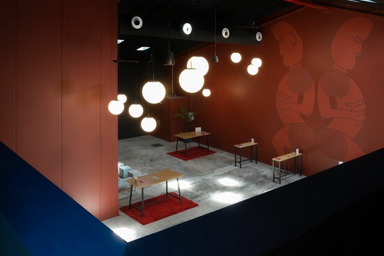
Te Pou Theatre Graeme Burgess, Wade Southgate, Burgess and Treep; Amber Curreen, Te Pou Theatre
The vision of Te Pou is that tikanga Māori led performing arts will transform the arts sector and make a necessary difference to society in Aotearoa and indeed the world. This very special Whare gives Te Pou the platform to provide mana uplifting experiences and storytelling through kaupapa Māori-led, collective approaches to performing arts. With this kaupapa, Te Pou will be transformative.
Gold Pin - Student & Academic Spatial
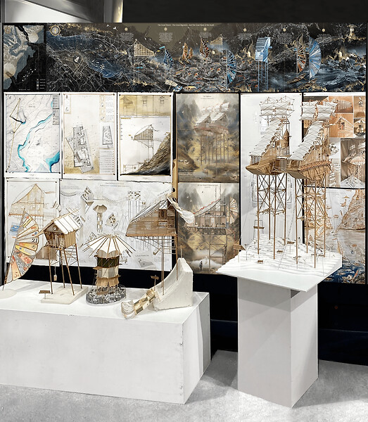
Dwelling in the Wrath of Nature: A tale of building resilience in the face of climatic adversity. - Elim Hu
‘Dwelling in the Wrath of Nature: A tale of building resilience in the face of climatic adversity' navigates the creative threshold between film storytelling and architecture, weaving the whirlwind magic of a whimsical narrative themed around apocalyptic hope with the imminent real-world threats of climate change, specifically the threat of dramatic sea level rise on our homes and communities.

The Best Design Awards are a major feature of the local design calendar and some of last year's winners are touring the country to offer first-hand insights into their projects.
This event is brought to you by Resene
Purple Pin - Toitanga
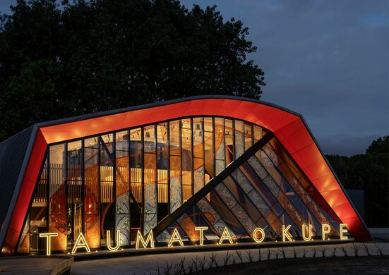
Taumata o Kupe - Nick Dalton, TOA
TOA worked closely with the client and Matua Rereata Makiha (1 of 5 tohunga that know the ancient korero around celestial navigation) to create the iconic urban cultural community hub. This project successfully encapsulates the knowledge and teachings of Mātauranga Māori through visual art and design through a collaborative process between TOA Architects, the clients and key stakeholders.
Gold Pin - Graphics
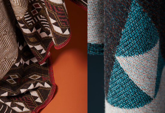
Limitless Range - Whakaawa Te Kani & Josh Te Kani
Intentionally drawing on Māori design, made here in Aotearoa, Noa Blanket Co. gives a deeper meaning to the ceremony of gift giving, sharing treasured designs that become an heirloom, supporting the transmission of intergenerational knowledge through art & textile. They believe sharing their individual story reiterates their connectedness, as the essence of each celebrates their shared core values.
Bronze Pin - Toitanga
Our Future is Māori - Sam Stuchbury, PDINZ & Katene Durie- Doherty, PDINZ, Motion Sickness
Whānau Ora represents a culturally-grounded and whānau-centric approach to well-being, emphasising the collective of whānau as the primary determinants of their own aspirations. A 'by Māori, for-Māori' approach means they focus on whānau as a whole, allowing them to determine their own goals, aspirations, and success fortified by the belief that with the support of whānau, one is never alone.
Gold Pin - Spatial
Te Tihi - Aurecon Auckland - Arron O'Hagan, Whare Timu (Ngāti Kahungunu, Te Arawa, Ngāti Tūwharetoa), WAM; Soltice Morrison, Aurecon
Their project initiation began with hosting workshops alongside members of Aurecon’s He Rautaki Māori rōpū, to ensure the project would connect with people and place. This process evolved into a collaboration with local iwi Ngāti Whātua Ōrākei, to discover co-design opportunities within the project and to personify Aurecon and co-create the project’s narrative.
Bronze Pin - Toitanga
Waiata Anthems - Damian Alexander & Noel Blackwell, FDINZ, LIKEMINDS
Building on the success of the 2019 album, LIKEMINDS were asked to reposition Waiata Anthems as a true movement for a bilingual musical landscape in Aotearoa. The path was clear – collaboratively create a Tohu (mark) and identity to match the hope and momentum of the movement. To expertly progress the tohu LIKEMINDS sought the help of their creative partners and friends Karl Johnstone and Joe Pihema from Haumi for their inspiration and insight.
“Saluting these legends of te reo Māori, the Waiata Anthems movement provides greater access to the language and culture for all… acting as a springboard for more Māori music to be heard across our airwaves.”

The Best Design Awards are a major feature of the local design calendar and some of last year's winners are touring the country to offer first-hand insights into their projects.
This event is brought to you by Resene
Purple Pin - Product
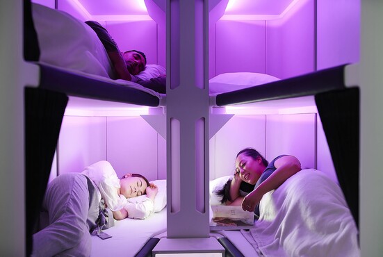
Air New Zealand Skynest™ - Zoe Wenn
It’s time to swap the headrest for some bedrest. Say hello to the world’s first sleep pods in the sky, the Skynest™. Designed in-house and set to be a gamechanger in aviation, Air New Zealand’s Skynest™ is a lie-flat experience for Economy class passengers. A standalone monument on the main deck of the aircraft it is comprised of 6 bunks for passengers to rest, stretch out and boost their physical and mental wellbeing during their journey.
Bronze Pin - Product
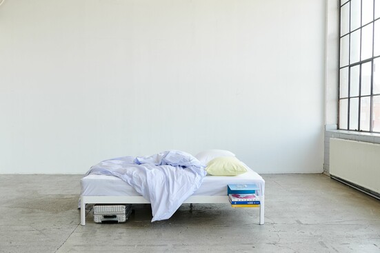
RF 100 Bed System - Tim Rundle, PDINZ
The RF-100 Bed frame is a modular system designed around considerations for usability, sustainability, logistics and longevity. Simplifying logistics was a key part of the brief, with the goal making the purchasing and delivery process as easy as ordering a pair of sneakers. To achieve this the frame was designed to pack down to a size suitable for standard courier delivery. The system includes a growing collection of accessories, currently comprising side tables and headboards that attach to the frame intuitively and with a minimum of assembly required.
Gold Pin - Product
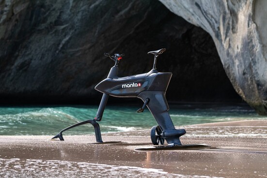
Manta5 SL3| - Alain Brideson, DINZ
The SL3 needed to be inspiring to behold and become the essence of the Manta5 vision. It was so important that the technical innovations became integrated, invisible and wrapped, in one slender hydrodynamic form. Not only did it need to have perfect balance in weight and volume for an enjoyable riding experience, but also to strike a balance in visual proportions to be a high performance and attractive piece of sporting equipment.
Gold Pin - Product
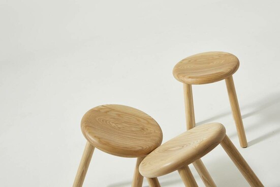
Double Happy Stool - Nathan Goldsworthy, PDINZ
Double Happy is a collection of stools in three heights made from turned American ash and cast bronze. The simple geometry is complemented by subtle detailing and weighty materials offering a sturdy, comfortable seat that will endure for generations.
Gold Pin - Product Student
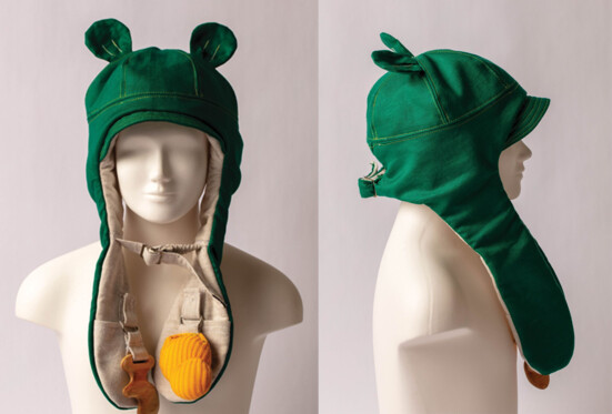
Hugg – Sensory Hat - Imogen McIntyre
The aim of this design was to create a child-friendly product that discreetly caters to sensory needs, conveys personality and allows children to stimulate and filter their senses in a healthy way to then establish healthy coping mechanisms that they can carry on. Hugg is primarily made with breathable organic cotton and stainless steel hardware. The hat is weighted with stainless steel beads and sound dampened with removable polyurethane foam pads. An under chin buckle helps keep the hat on and unwanted sounds out. The chewable attachment is made from maple timber and sealed with food safe Walrus Oil. Stimulation attachments on both sides can be tucked away into the pockets at the ends of both “ears” and also easily removed for cleaning and swapping out by simply unbuttoning the snaps.

The Best Design Awards are a major feature of the local design calendar and some of last year's winners are touring the country to offer first-hand insights into their projects.
This event is brought to you by Resene
Purple Pin - Graphics
Blunt - Ben Reid, PDINZ & Anthony Hos, DINZ, Milk
Blunt umbrellas are an award-winning iconic Aotearoa New Zealand product. Beautifully designed, they are a true kiwi innovation. To grow the brand into new international markets the Milk team, Ben & Anthony, worked with Blunt on new design principles of reduction, beauty, confidence, and joy.
Purple Pin - Toitanga

Taumata o Kupe - Nick Dalton, TOA
TOA worked closely with the client and Matua Rereata Makiha (1 of 5 tohunga that know the ancient korero around celestial navigation) to create the iconic urban cultural community hub. This project successfully encapsulates the knowledge and teachings of Mātauranga Māori through visual art and design through a collaborative process between TOA Architects, the clients and key stakeholders.
Gold Pin - Spatial
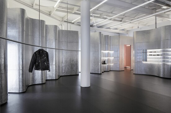
Stolen Girlfriends Club Wellington Flagship Store - Dean Poole, FDINZ, Alt Group; Jun Tsujimoto, Jasmax
The brief was to develop a concept that captured the fashion label’s independent spirit and energy in built form. The resulting space challenges the conventions of retail design with an ‘anti-retail’ stance and redefines the concept of luxury with a design inspired by contemporary art. The store appears as though an inverted disco ball, pumping with light in the centre to draw in customers while resembling a blacked-out club from the exterior.
Gold Pin - Spatial, Emerging Designer
Thomas Seear-Budd - Thomas Seear-Budd
In 2019 Thomas, alongside his business partner James Ross, established Seear-Budd Ross, a design-focused architecture and interiors studio. In four short years, Thomas has delivered a collection of projects across the country, from private residences and cafes to retail offerings and furniture pieces.
The Best Design Awards are a major feature of the local design calendar and some of last year's winners are touring the country to offer first-hand insights into their projects.
This event is brought to you by Resene
Purple Pin - Graphics
Blunt - Ben Reid, PDINZ & Anthony Hos, DINZ, Milk
Blunt umbrellas are an award-winning iconic Aotearoa New Zealand product. Beautifully designed, they are a true kiwi innovation. To grow the brand into new international markets the Milk team, Ben & Anthony, worked with Blunt on new design principles of reduction, beauty, confidence, and joy.
Purple Pin - Toitanga
Taumata o Kupe - Nick Dalton, TOA
TOA worked closely with the client and Matua Rereata Makiha (1 of 5 tohunga that know the ancient korero around celestial navigation) to create the iconic urban cultural community hub. This project successfully encapsulates the knowledge and teachings of Mātauranga Māori through visual art and design through a collaborative process between TOA Architects, the clients and key stakeholders.
Gold Pin - Spatial
Rammed Earth House - Charlie Nott, Nott Architects
The brief was to form a house that was strong but simple in form; merged with the landscape and have a sustainable story. It was to be contemporary but not ostentatious, fitting into its surrounds. Respectful to its environment. Sited to capture the expansive views.
Gold Pin - Spatial, Emerging Designer
Thomas Seear-Budd - Thomas Seear-Budd
In 2019 Thomas, alongside his business partner James Ross, established Seear-Budd Ross, a design-focused architecture and interiors studio. In four short years, Thomas has delivered a collection of projects across the country, from private residences and cafes to retail offerings and furniture pieces.
The lead up to our most prestigious night of the year is the ideal time to bring the design community together to reflect and connect. During Best Week we hold a series of events that build towards the industry's big night out at the Best Design Awards.
Best Design Awards 2021 - Neighbourhood Host - Three Sixty Architecture
Best Design Awards 2021 - Neighbourhood Host - EdwardsWhite Architects
Best Design Awards 2021 - Neighbourhood Host - Motion Sickness
Best Design Awards 2021 - Student Host - Media Design School
Best Design Awards 2021 - Student Host - Massey University College of Creative Arts
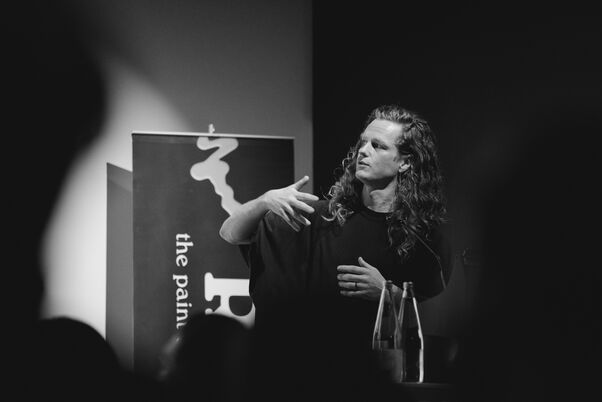
Every designer’s career journey contains valuable lessons for students looking to their own futures. Our Student Council interview leading New Zealand designers and gain valuable insights into how they got to where they are.
DINZ Student Council organise Designers to present on their journey after leaving design school. These events are part of our Designers Speak® brand and held in the school studios.
The Student Council invite a studio to particpate in Folio Nights where Designers are connected with students and give advise on their folios as they move into their graduating year.
DINZ Student Council Folio Night at Gladeye with Media Design School 2023
DINZ Student Council Folio Night at Space Studio with AUT 2023
DINZ Student Council Folio Night at ClemengerBBDO with Massey 2023
DINZ Student Council Folio Night at Fisher & Paykel Appliances with AUT 2023
DINZ Student Council Folio Night at Monk Mackenzie with UoA 2023
DINZ Student Council Designers Speak®️ at AUT - Graphics 2023
DINZ Student Council Folio Night at Milk with Whitecliffe 2022
DINZ Student Council Folio Night at Springload with Massey 2022
DINZ Student Council Folio Night at ClemengerBBDO with Massey 2022
DINZ Student Council Folio Night at Fearon Hay with UoA 2022
DINZ Student Council Folio Night at Fisher & Paykel Appliances with AUT 2022
DINZ Student Council Designers Speak®️ at Media Design School - Digital
DINZ Student Council Folio Night at Inhouse with Whiteliffe 2021
DINZ Student Council Folio Night at Warren & Mahoney with UoA 2021
DINZ Student Council Folio Night at Clemenger BBDO with Massey 2021
DINZ Student Council Folio Night at Roam with Media Design School 2021
DINZ Student Council Folio Night at Material Creative with AUT 2018
Designers Speak® at AUT — Olivia Harper, Material Creative 2017
Designers Speak® at Whitecliffe — Sarah Gladwell, Inhouse 2017
Designers Speak® at Victoria — Simon Hardy, Studio Pacific Architecture 2017
The more we talk about design in New Zealand, the more robust the conversation becomes. Our Designers Speak events give our members the chance to hear top designers sharing insights into their work.
Best of the Best Designers Speak® - Christchurch - supported by Resene 2023
Best of the Best Designers Speak® Auckland3 - Product & Value of Design
Best of the Best Designers Speak® Auckland1 - Graphics, Digital & Motion
Best of the Best Designers Speak® Wellington - supported by Resene
Best of the Best Designers Speak® Christchurch - supported by Resene
Best of the Best Designers Speak® Auckland4 - Toitanga - supported by Resene
Best of the Best Designers Speak® Auckland3 - Spatial - supported by Resene
Best of the Best Designers Speak® Christchurch - supported by Resene
Designers Speak® Black Pin - Liz and Neville Findlay, Zambesi
Best of the Best Designers Speak® Auckland3 — Boutique Awards
Designers Speak® - a conversation between Peter Haythornthwaite FDINZ , ONZM and Michael Barrett
Designers Speak® — Danny Coster: Exploring the Tapestry of Creativity
Great design can flow both ways across the ditch. This event encourages that trans-Tasman design dialogue, and is a collaboration between the Australian Graphic Design Association (AGDA) and DINZ.
Dulux DIAlogue on Tour is a Study Scholarship, brought to you by Dulux, The Designers Institute of New Zealand (DINZ) and the Design Institute of Australia (DIA).
Supported by design schools and studios, Folio Night is an initiative from the DINZ Student Council. Each event is a prestigious opportunity for nominated students to present their work for discussion and critique.
DINZ Student Council Folio Night at Gladeye with Media Design School
DINZ Student Council Folio Night at ClemengerBBDO with Massey
DINZ Student Council Folio Night at Fisher & Paykel Appliances with AUT
DINZ Student Council Folio Night at Clemenger BBDO with Massey
DINZ Student Council Folio Night at Fearon Hay Architects with the University of Auckland
DINZ Student Council Folio Night at Fisher & Paykel Appliances with AUT
Folio Night at Clemenger BBDO with Massey University, College of Creative Arts
Folio Night at Inhouse Design with Whitecliffe College of Arts and Design
Folio Night at Warren and Mahoney Architects with University of Auckland
Folio Night at Jasmax with Auckland University of Technology
Folio Night at Fisher & Paykel Appliances with Auckland University of Technology
Folio Night at Designworks with Auckland University of Technology
Folio Night at Chrometoaster with Massey University, College of Creative Arts
Folio Night at Material Creative with Auckland University of Technology
Folio Night at Space Studio with Auckland University of Technology
Folio Night at Colenso BBDO with Auckland University of Technology
Good design can transcend geography’s barriers. And many inquisitive and ambitious New Zealand designers have made the brave and uncertain move of shifting overseas. At No Borders, they return home to share what they have learned.
We all have a natural curiosity about the spaces in which designers create. Open Studio offers a rare opportunity to enter these private worlds, and see the inner workings of some of New Zealand's best studios.
Hamilton Design Series — Open Studio™ at Edwards White Architects
With digital technology, design is in a state of constant change. This event series gives designers a forum to discuss how this impacts on their innovation process; how they push ideas from the abstract into the real; and on how quickly they bring products to market.
This series of informal events is primarily a forum for spatial designers to meet and share insights. A broad range of relevant topics are presented and discussed including useful tools and tips, the latest design trends and best industry practice.
The Form Forum® - Manaaki - Bossley Architects & Cheshire Architects 2022
The Form Forum® - Manaaki - Space Studio & Material Creative 2022
This series of informal events is primarily a forum for graphic designers to meet and share insights. A broad range of relevant topics are presented and discussed including useful tools and tips, the latest design trends and best industry practice.
The Graphics Forum — Getting the Best from Photography — Christchurch
The Graphics Forum — Getting the Best from Photography — Auckland
This series of informal events is primarily a forum for product designers to meet and share insights. A broad range of relevant topics are presented and discussed including useful tools and tips, the latest design trends and best industry practice.
The Business Architect - Design Practice Owner’s MasterClass - March
Resene Webinar - Timber – The Protection of Wood with Coatings
Resene Webinar - Exterior Steel - Atmospheric Corrosion & Achieving Durability
Exhibition Open — Olafur Eliasson: The cubic structural evolution project
Jacob van Rijs: Architectual Inspirations — Auckland & Christchurch
Exhibition Open — Olafur Eliasson: The cubic structural evolution project
Design Law — Christchurch, Getting Paid & Keeping Your Shirt
Dale Herigstad — Evolution of the Screen in Media: A Post-Screen Future
The more we talk about design, the more robust the conversation becomes.
DINZ events give access to designers at the top of their game as they share their knowledge and insights.
The audiovisual recordings from some of these gatherings can be found under this Video category and are archived there as a reference resource to Aotearoa’s rich design history.
Designers Speak® Across the Ditch 2023 - Video - Dominic Hofstede
Best of the Best Designers Speak® 2023 - AKL4 - Video - Kyani, Sisi, Jordan
Best of the Best Designers Speak® 2023 - AKL4 - Video - Bella Martin
Best of the Best Designers Speak® 2023 - AKL4 - Video - GHD Design & Studio Pasifika
Best of the Best Designers Speak® 2023 - AKL4 - Video - Paku
Best of the Best Designers Speak® 2023 - AKL3 - Video - Metalbird
Best of the Best Designers Speak® 2023 - AKL3 - Video - No Trace Waste
Best of the Best Designers Speak® 2023 - AKL3 - Video - Lucy Grunfeld
Best of the Best Designers Speak® 2023 - AKL3 - Video - Special Group
Best of the Best Designers Speak® 2023 - AKL3 - Video - Formway
Best of the Best Designers Speak® 2023 - AKL2 - Video - Creature Post, Kog Studio, Stardome
Best of the Best Designers Speak® 2023 - AKL2 - Video - spacelamp
Best of the Best Designers Speak® 2023 - AKL2 - Video - Warren and Mahoney Architects & 2degrees
Best of the Best Designers Speak® 2023 - AKL2 - Video - LandLAB & Eke Panuku
Best of the Best Designers Speak® 2023 - AKL2 - Video - Oli Booth Architecture
Best of the Best Designers Speak® 2023 - AKL1 - Video - Alec Bathgate
Best of the Best Designers Speak® 2023 - AKL1 - Video - Designworks & Stuff
Best of the Best Designers Speak® 2023 - AKL1 - Video - The Warehouse Group
Best of the Best Designers Speak® 2023 - AKL1 - Video - Four Square
Best of the Best Designers Speak® 2022 - Video - Park Hyatt Tukutuku
Best of the Best Designers Speak® 2022 - Video - Tū Ana Ngā Pou Angitu
Best of the Best Designers Speak® 2022 - Video - Kuki Reka Kani
Best of the Best Designers Speak® 2022 - Video - Te Ahi Tupua
Best of the Best Designers Speak® 2022 - Video - Te Rau Karamu Marae
Best of the Best Designers Speak® 2022 - Video - Kowhai Wrap Screen
Best of the Best Designers Speak® 2022 - Video - 2250 Ultracab Walk-Thru
Best of the Best Designers Speak® 2022 - Video - Gastric Alimetry
Best of the Best Designers Speak® 2022 - Video - Te Tatau Kaitiaki
Best of the Best Designers Speak® 2022 - Video - The Hotel Britomart
Best of the Best Designers Speak® 2022 - Video - Tiaho Mai Acute Mental Health Inpatient Unit
Best of the Best Designers Speak® 2022 - Video - SCION Innovation Hub
Best of the Best Designers Speak® 2022 - Video - Voice of Racism
Best of the Best Designers Speak® 2022 - Video - Optus Yes Expressions
Best of the Best Designers Speak® 2022 - Video - Toi Tu Toi Ora: Contemporary Māori Art
Best of the Best Designers Speak® 2022 - Video - Proud to be Māori
Best of the Best Designers Speak® 2022 - Video - Double Take
Best of the Best Designers Speak® - Video - Tim Denee, Chris McDowall & Nicola Legat
Best of the Best Designers Speak® - Video - Warren and Mahoney Architects
Best of the Best Designers Speak® - Video - Kate Pilot Design
Best of the Best Designers Speak® - Video - Wingate Architects and Foodstuffs
Best of the Best Designers Speak® - Video - Boffa Miskell & Tupara Studio
Best of the Best Designers Speak® - Video - Cheshire Architects
Best of the Best Designers Speak® - Video - Beca Architects & Rangi Kipa
Best of the Best Designers Speak® - Video - Extended Whānau and Maree Sheehan
Best of the Best Designers Speak® - Video - Locales and Waipā District Council
Design of the StartUp - Graphics - Video - Previously Unavailable
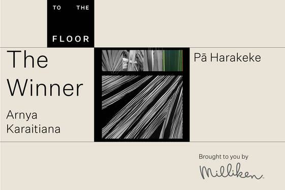
Winner Announced
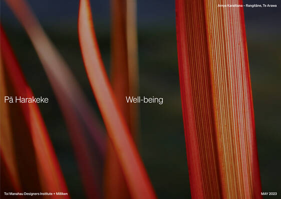
Congratulations to Arnya Karaitiana
Arnya Karaitiana
"It’s still sinking in to be honest. To be selected alongside such exceptionally talented and creative minds is a truly humbling experience. Ngā mihi maioha ki a koutou katoa…a big thanks to everyone involved. What’s even more rewarding for me is seeing the presence of Te Ao Māori and Te Reo Māori within the other entries shared (shortlisted). Insights, concepts, designs all celebrating our unique cultural heritage and inspiring our peoples wellbeing. I’m truly thankful to be able to journey through this space with so many other like-minded people.
For me, my concept is a reflection of my Te Reo journey thus far, gathering stories of my whakapapa, a growing collection of thoughts and an appreciation of living here in Aotearoa.
I look forward to sharing part of who I am and taking a piece of Aotearoa to the world. E rere ana te mihi nunui koutou. Mauri ora."
Shaneel Deo, Managing Director, Milliken (Australia) Pty Ltd
The “To the Floor” competition is an avenue for Milliken to support the design community in New Zealand and we are delighted with the response and quality of submissions this year.
We at Milliken would like to congratulate Arnya Karaitiana on winning the competition and look forward to collaborating with Arnya to showcase her designs to the world.
Arnya will work with Milliken's creative director, James Mfula, to develop a commercial carpet tile collection that will be manufactured and sold globally earning the winner 3% on sales.
A further 2% of sales will go to Key To Life charitable trust.
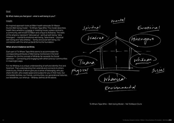
For me Whānau is a unique understanding of self and identity first and foremost. That understanding then extends and connects to others close to you, those of whom give you a sense of belonging, who you share life with, who create space and a place for you in their lives.
Our immediate families, our friends, communities, our generational histories, our bloodlines, our whenua - Whānau defines all the above.
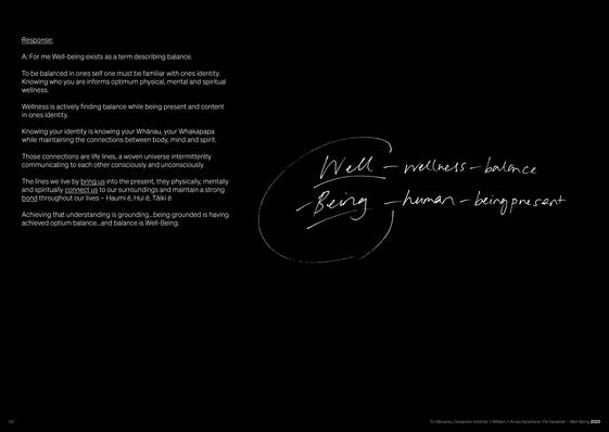
To be balanced in one’s self, one must be familiar with one’s identity. Knowing who you are informs optimum physical, mental and spiritual wellness.
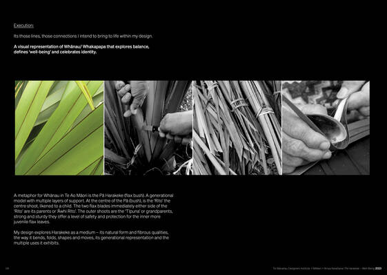
A metaphor for Whānau in Te Ao Māori is the Pā Harakeke (flax bush). A generational model with multiple layers of support. At the centre of the Pā (bush), is the ‘Rito' the centre shoot, likened to a child.
The two flax blades immediately either side of the 'Rito' are its parents or 'Awhi Rito'. The outer shoots are the 'Tīpuna' or grandparents, strong and sturdy they offer a level of safety and protection for the inner more juvenile flax leaves.
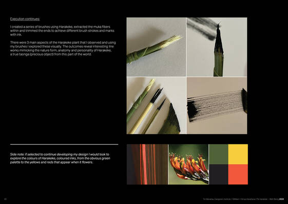
I created a series of brushes using Harakeke, extracted the muka fibres within and trimmed the ends to achieve different brush strokes and marks with ink.
There were 3 main aspects of the Harakeke plant that I observed and using my brushes I explored these visually.
The outcomes reveal interesting line works mimicking the nature form, anatomy and personality of Harakeke, a true taonga (precious object) from this part of the world.
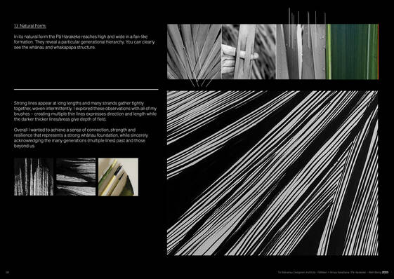
Strong lines appear at long lengths and many strands gather tightly together, woven intermittently. I explored these observations with all of my brushes - creating multiple thin lines expresses direction and length while the darker thicker lines/areas give depth of field.
Overall I wanted to achieve a sense of connection, strength and resilience that represents a strong whānau foundation, while sincerely acknowledging the many generations (multiple lines) past and those beyond us.
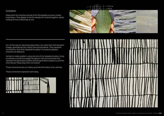
I aimed to create a pattern using only one of my harakeke brushes, trying to maintain a similar line weight throughout. Here the horizontal lines represent the generations before and the generations beyond us and the lines that join these keep them connected.
Those connections are our history and hold information of our identity.
Those connections represent well-being.
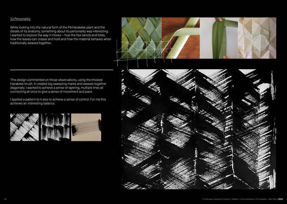
While looking into the natural form of the Pā Harakeke plant and the details of its anatomy, something about its personality was interesting.
I wanted to explore the way it moves how the flax bends and folds, how the leaves can crease and hold and how the material behaves when traditionally weaved together.
I applied a pattern to it also to achieve a sense of control. For me this achieves an interesting balance.
Whānau and Whakapapa - our heritage is of great importance to me personally and has a big influence on my well-being.
- Arnya Karaitiana
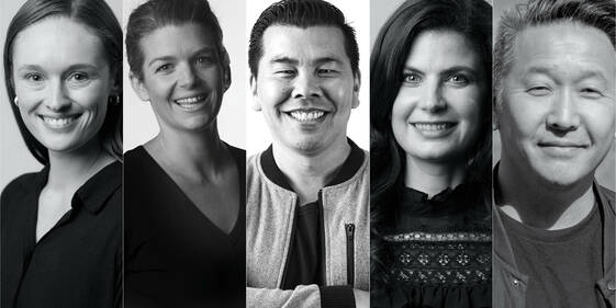
Pictured left to right: Amy Tasker, Asha Page DINZ, Jef Wong FDINZ, Erini Compton PDINZ, Kelvin Soh FDINZ
In the competition To The Floor – Well-being, we looked for designs that embraced a blend of positive interconnectedness that enriched people’s lives physically, psychologically, socially, and ecologically.
To The Floor – Well-being provided the opportunity for entrants to create a design inspired by how well-being felt to each individual.
Thank you to everyone who entered, it was an impressive body of work that the judges enjoyed pouring through.
SHORTLIST 2023
CONGRATULATIONS to our shortlist.
Alice Murray
This brief really spoke to me at this junction in my life. I have recently become a mother, a huge shift in my lifestyle and priorities, where for the last year most of what I have done is for someone else. When I have the opportunity to have some time for myself, I find myself needing to reflect, and learn who I am in this new role where many parts of my old self have been lost. It brings me back to discovering what well-being feels like for me.
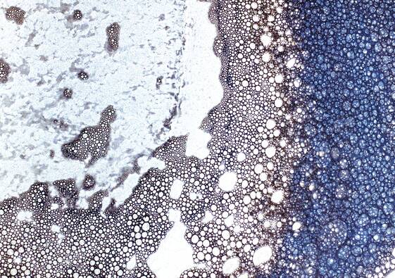
Well-being for me is feeling grounded physically, mentally, emotionally. The place I feel this is the ocean. Where the water meets the sand, the ebb and flow, a yin and yang that has an ever adapting rhythm.
I wanted to explore this visually - and express yin and yang through dark and light, complex vs simple. Through photography and interpretation of the image I have created a series of explorations that explore the connection of water to earth.
Christine Park - Sing A Song
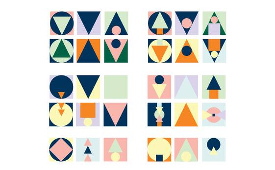
Whether we notice it or not, we are exposed to a variety of spectrum of colours. Supermarket - Colourful fruits, lollies, vegetables, soft drinks etc. Streetlights, Neon signs, Clothing store, weather, sky, people.
We co-exist with people from different cultural backgrounds, different life experiences, different characteristics and so on.
This is what makes our life interesting! We cannot live this life on our own but we live with other people in harmony. We talk to each other, and share our stories, at work we work collaboratively with different types of people in different fields of expertise. We share our culture and hobbies and we play sports together. We are not alone. We are here for each other and we courage to love one another.
We laugh together we cry together, we help each other and we care for one another. This I find is another way of being well. Well-being. That we don’t exist on our own but together in harmony and balance.
The designed pattern and colour palette are inspired by diversity and individual personalities. Everyone has their own unique individual characteristics and we appreciate each other. We live in harmony, and we collaborate all the time whether we notice it or not.
Janae Van Panahon & Dorita Hannah - RARANGA Woven Grounds
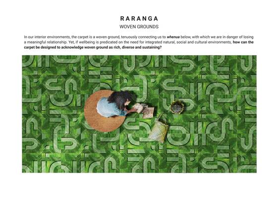
In our interior environments, the carpet is a woven ground, tenuously connecting us to whenua below, with which we are in danger of losing a meaningful relationship. Yet, if wellbeing is predicated on the need for integrated natural, social and cultural environments, how can the carpet be designed to acknowledge woven ground as rich, diverse and sustaining?
Wellbeing is to-be-well, especially together: emphasizing interconnection among people as well as between them and this fragile planet, which requires equitable access to quality surroundings. This includes the built environment, which should welcome, host and enable the public through design sensitivity that interweaves people, place and material. As a form, the carpet is an inherently woven ground — literally and metaphorically — drawing spatial threads together and holding space through its sensory layered surface.
In Te Reo Māori, as in English, ‘RARANGA/weaving’ is both an action and an artefact… a doing and the thing done. Weaving is an important aspect of Pacific cultural life and whenua itself could be seen as an interweave of elements — earth, plants, animals insects and humans. Unlike European humanism, an indigenous worldview doesn’t separate human and non-human, nature and culture.
As an act of weaving, Raranga is seen by many as an active tool, helping us make sense of the material world, which is both natural and constructed. It could be thought of as a sensory, sensible and sensational tool… primarily appealing to touch as a sensation: a pleasurable mode of feeling that helps us know and be in the world. Drawing on the French philosopher, Jacques Rancière, this relates to ‘distribution of the sensible’ as a politics of aesthetics where a well-designed sensory world should be available to all.
RARANGA proposes a fluid interweaving abstract pattern, in which the carpet pile varies in length. This variation is not only seen by the eye, but is also sensed by the bare foot, tactile hand and even through clothing or the soles of our socks. It invites us to remove our shoes and engage bodily with touch as well as through the haptic eye. The ground is not a smooth frictionless surface but a natural landscape of valleys and ridges as well as a constructed urbanscape of networks and roadways. This interweaving of culture and nature emphasises our lived world as neither one thing nor another. Pops of colour remind us that the woven ground is not homogenous but accented and interesting.
RARANGA invites us to weave with our eyes and with our bodies. It encourages children to trace the territory with their toys and stimulates our imaginations to get lost in a spatial labyrinth.
Emphasising collectivity, RARANGA evokes the natural through texture, pattern and colour, accentuates the social by interweaving the tactile ground with people and things, and draws on the cultural to emphasise that the world itself is a co-constructed and diverse interweave.
Kate Pilot & Natalia Glucina -
Mountainscape - Play
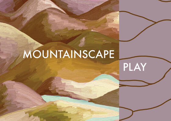
If we can make time to explore creatively we can regulate our emotional state through powerful experiences. To gain balance and calm we need energy, we need play. It loosens the space in our minds otherwise consumed by all our thoughts and the to-dos. Mountainscape embeds play into our spatial environment.
What we understand of Well-being
Well-being is complex. It connects to all aspects of our lives and varies from one to another. We see well-being as something that is a constant pursuit, achieved by stimulating the balance of body and mind. More often this theme is associated with slowing down, out breaths and quiet meditations. Because of this we wanted to explore a contrasting, vibrant and higher energy. And to consider how this lifts moods and makes us smile to create a positive environment. We looked to 'PLAY'.
'PLAY' is typically reserved for children but is also important in adulthood. It's what makes us happy, helps us learn and stimulates parts of the brain otherwise inactivated. Singing loudly, dancing wildly or witnessing the power of mother nature and our insignificance within her mass. If we make time to explore creatively we can regulate our emotional state through powerful experiences.
Nature is also a key influencer of balance and well-being. Within nature's ecosystem, we find lots of textures, colours and movement. High contrast, low contrast, light and dark interplay, there are many shapes and forms within each element. You can view it broadly or focus in on the details, there are so many layers of texture to create such richness. All of these are stimuli for the mind and create a sense of calm and comfort as well as creating aspiring positive feelings that are an integral part of wellbeing. It would be boring to live in a constant state of calm. It is the high energy and low energy phases that allow us to appreciate the other and find connection in each.
As work consumes a significant number of hours in our week, it makes sense this experience impacts our over-all well-being. We wondered how we could visually embed 'PLAY' into our daily life. How could it impart its energy to those it surrounds? Nature, art, movement, colour and texture all express and evoke a mood in us. We combine these to create a more positive environment and ultimately alleviate stress, create greater engagement and better experiences. Essentially improving one's quality of life.
Lauren Gibbs - Pattern In Hand
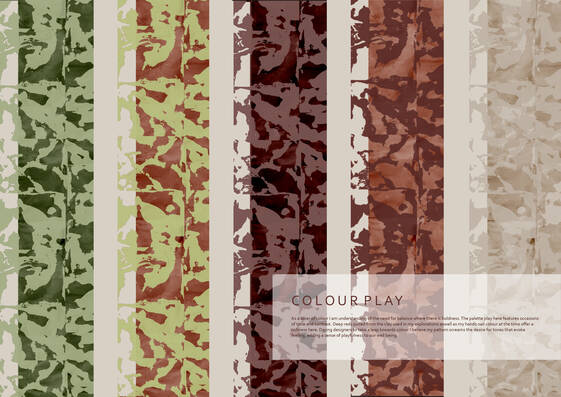
What evokes a sense of positive wellbeing for you may sit slightly similar or completely different to what does for me. It is this difference that I find most wonderful.
As a creative it is the movement & inquisitive activation of my very own hands in the process of hand craft that allows for a positive sense of well-being to manifest within. Having the mind constantly turned on as we exist in a world so full of noise and demand, to sit and create with the hands offers an opportunity to be transported outside of this, offline.
Our hands exist as valuable tools used daily, allowing us to carry out practical tasks. They allow us to connect outwards into the world around us, aiding in our understanding of surface, mechanics, temperature and depth. Through our hands we learn, we explore. The specific occurrence of TOUCH that so seamlessly exists on mass within our days for me is where my minds is its most content, with my curiosity so wondrously engaged and my own well-being flourishing because of this.
Touch connected back to the concept/act of making is where I find most comfort and internal serenity. My ability to with my hands manipulate material, imprinting or controlling surface breeds a sense of wonder within as my mind focuses in on the sensory moment of touch playing out in front of me at my very own finger tips. The neurological stimulation that touch and hand making offers me calms any noise of life that may exist close. As my hands push into surface, or simply rest upon it, a heightened sense of awareness and appreciation prevails, slowing time, manifesting a sense of ease.
My entry exists as an explorative play in an attempt to capture the method in which I believe my well-being flourishes, as my hands engage with surface. The resulting visuals become frozen moments, or memories of touch - moments where I felt most at ease, in the middle of a creative process or physical creative action.
Rebecca Wyborn & Marnia De Sousa - MĀRA
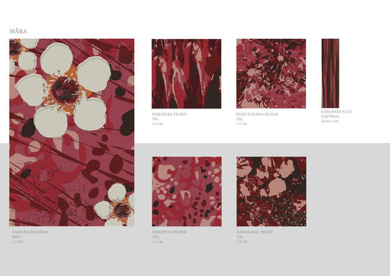
Māra’s commitment to promoting wellness through biophilic design and native New Zealand flora, is a testament to the importance of our connection to nature for our health and wellbeing. As we seek to achieve optimal physical, mental, spiritual, and social health, it is essential to recognize the role that our relationship with the natural world plays in achieving these goals.
To further strengthen our connection to nature, we must come back to our roots and embrace traditional ways of healing. This includes reconnecting with the land, living with flora, and incorporating the healing properties of native plant species into our daily lives. Māra’s carpet designs serve as a tool to re-establish this connection and promote a boundless relationship with nature.
Research was conducted on the health benefits of different plant species, which informed the selection and integration of specific flora into the designs, promoting healing from the inside out. For example, Manuka flowers are known to strengthen our immunity and reduce anxiety, while Harakeke calms and soothes inflammation. Kawakawa helps with respiratory health and gastrointestinal issues, while Horopito supports circulation and can be used as a form of pain relief. Finally, Pōhutukawa’s have been used topically to heal wounds and abrasions, demonstrating the powerful healing properties of New Zealand flora.
Māra has been inspired by the colour palette of native flora, drawing from the hues of Manuka, Harakeke, Kawakawa, Horopito and Pōhutukawa. These colours have a powerful effect on our mood and energy, fostering a sense of connection and renewal. In Māori culture, red symbolizes the forest and is the colour of the earth from which all living things emerged.
Incorporating these principles into our designs required a fusion of hand sketching, Photoshop, and Illustrator to work with images of flora. The result is a collection of designs that draws inspiration from the hues and patterns of native flora from Aotearoa’s landscape and incorporates the unique health properties of these plant species.
By embracing biophilic design and the healing properties of native flora, Māra strives to create interior spaces that promote hauora (health) and foster a sense of connectedness with nature and others. As we continue to prioritize wellness and pursue optimal health, it is essential to recognize the role that nature plays in achieving these goals and to incorporate these principles into our daily lives.
Olivia Collinson - Sky Palette
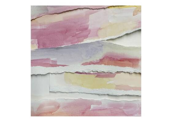
Sunrise: A colour crush, a warning, a changing light, an ethereal glow, a moment of still, a wakeup call.
The clouds: bunched and tethered, coarse and overlapping, thick and voluminous, stretched out like tea leaves; a portents of the day.
The sky: endless, ranging, celestial. Close and soft and heavy.
We look up to take a reading of the world, and of ourselves. We’re changing with it, moving with it, in opposition to it. The sky is the palette of our lives.
I woke up early as the light was rising through the blinds. I pulled open the window, threw my face to the wind, and my eyes to the sky. Pinks and reds and blues and purples burned across shaggy clouds. This simple gesture of looking up and out inspired a moment of awe, of calm, and of reflection.
Sky Palette draws from the hues of sunrise; using washes of pinks, reds, oranges, blues to conjure up the changing morning sky. Initially, bodies of colour were applied to paper. Tearing up the paper into long strips created a soft, white cloud-like edge. These strips were overlaid, placed back to front and in mixed up combinations, to mimic the changing light and cloud formations of dawn.
Silvia Kostandini - Seaside Moments
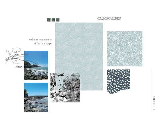
The proposed SEASIDE MOMENTS design series develops as a narrative of the different interactions experienced at the beach. Different elements of the seaside landscape inspire the design proposal to offer a sense of well-being. Since moving to Auckland from Italy a few years ago, I have found that the beach environment has the power to nurture a sense of grounding and peace. A place to calm your thoughts, connect with the surrounding elements, and exercise. During my own experience of the beach, I have found inspiration from the way the water comes into the landscape, the sounds of the ocean, and the scents of the sea. The interaction between water and land becomes the materials and textures that the series draws from.
The idea developed as a series of designs that recall the memory of a walk along the beach. The three drawings act as a story of walking on the sand, through the rocks and submerging in the water. Each of the works has an atmosphere of its own, but they all work alongside to shape new sensations and memories. The marine landscape connects us with many different feelings, experienced differently from one person to the other, but all promoting a sense of positive energy and shaping a relaxing image in people’s minds.
The composition of each design is inspired by the materials and textures found at the beach. With a biophilic design approach, the drawings recall the natural elements as abstract compositions. Creating a visual connection between the natural elements of water & earth and the viewer. The repetition and freeform of the textures recall the organic nature of the beach and become new grounds to walk on.
That sense of calm and grounding is further developed by the use of colours in each of the designs. The shades and tints enable the drawings to acquire new sensations, emotions, and memories.
ROCKS reflects on the stones that inhabit the beach, where water and rocks layer to create the image of a coastline. The choice to incorporate blues aims to promote a sense of calmness and serenity.
SAND is informed by the memory of a walk along a sandy beach, the neutral tones offer a grounding sensibility where people feel a connection with the ground they walk on.
SUNSET WATER is a reflection of the unbound and peaceful nature of water. The choice to use colours that recall the sunset is a way to reflect the nurturing and harmonious feelings of this calming image.
The SEASIDE MOMENTS collection is an invitation to find a sense of well-being through memories of calming, grounding, and peaceful moments.
Rachel Wegrzyn
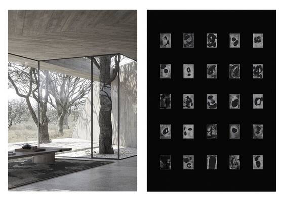
I am proposing a mesmerizing rug design that goes beyond mere aesthetics, for it is an artwork that encapsulates the essence of craft, well-being, and mindfulness. Drawing inspiration from the Rorschach inkblot tests, the rug’s composition is a rendition of an original ink print from a collection of works I have produced.
The Rorschach test, a quintessential tool to understand one’s psyche, employs a series of inkblots to gauge personality and emotional health. In the rug’s abstract inkblot pattern, one finds a visual symphony that beckons the viewer to delve deep into the realms of introspection and reflection.
It is imagined that the rug’s woven composition is a collation of varying textures and natural fibres, with the intricacy of its pattern evoking a sense of awe-inspiring artistry. In its neutral hues, one finds a timeless sophistication that blends effortlessly with any decor. It is a refined and sculptural artwork that will inspire intimate discussion centred around one’s personal psyche.
The proposed rug is a statement of beauty and introspection, an exquisite amalgamation of art and function that imbues a space with a serene ambiance. Its abstract Rorschach pattern is a stirring invitation to contemplate, to journey within, and emerge anew. Whether as an accent to a room or a gateway to mindfulness, this rug will leave an indelible mark within any space.